2007-06-16, 10:44
|
Link #62 | |
|
Thinking outside the box
 Graphic Designer Graphic DesignerJoin Date: May 2007
Location: The Netherlands
Age: 37
|
Quote:
And from what i see the sigs on first page has quite a unique style. I haven't saw the style much or not at all. And he the Haruhi one got me impressed. So your going the right direction. Keep up the good work, and keep moving towards your dream. No matter how slow it might seem. The longer you waited for it the more worthwhile it will be.  Hope to become a good graphic designer myself to someday 
__________________
|
|

|

|
|
2007-06-19, 18:13
|
Link #64 |
|
Senior Member
Graphic DesignerJoin Date: May 2007
 |
Nooo...not the second page :P
I was taking a short break, just doing some other stuff...but i'm back now and refreshed ^^ For the neko fans out there Still experimenting ^^  Loving this one  Hmmm  I hate making these.....Bah Some Dark Saber sigs 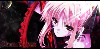  Request  Lucky star:  edit: 
__________________
Last edited by Epsilon; 2007-06-19 at 19:56. |
|
|
|
|
2007-06-19, 20:29
|
Link #65 |
|
Hail pork!
Graphic DesignerJoin Date: May 2007
Location: Silicon Valley
|
Your first one has some really nice effect and the color glittering around her head is spread out quite nicely. The mood of the sig is fitting the render's facial expression.
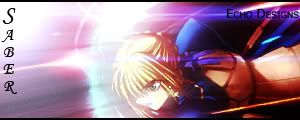
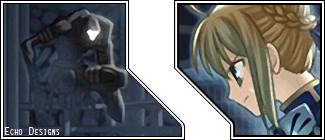
2nd: one is very simple but you can see some fine detail emerging from c4d. Not too much and not too little... just balanced. 3rd: Hmmm, pop out sigs are sometimes hard to critique... I would just bring out some dark shades on her and that's about it. 4th: Dark saber! It's a nice position she's in. All I would suggest here is just to give that black bg a little bit of something just so it the render doesn't look like it was placed on top of that bg. 5th: This one is my next best favorite... you need to keep the bg style. It's different from what I've seen out there and it's nice. 6th: All we've already discussed the quality of this render. Not your fault. 7 & 8: gotta love lucky star character! It's kawaii!
__________________
|
|
|
|
|
2007-06-20, 17:16
|
Link #67 |
|
Hail pork!
Graphic DesignerJoin Date: May 2007
Location: Silicon Valley
|
hmmm, The first one has a galactic feel to it because of the bg. You're right about her hair, it's a bit annoying when you see that end chopped off. I say you go back that there and manually shape it correctly to make it more natural. Apply some level level balances on the bg to bring out more color since it's space. Those kinds of colors should come out more since the space is pretty much black. Once you do that, then you can apply some level balance on the render to compliment it.
I like this one the most except that the text on the left really kills the presentation. It just doesn't go. How about changing the text fill to white and changing the mode from normal to soft light... Try playing around with those but right now, it does stick out like a sore thumb. Either than that, the placement of the render compliments the bg's look. Good job here. This would be a nice one if the quality of the images were high... but since they're not, it's really not working out to well. Of course you're still in experimental mode so I suggest using hi res images for this kinds of style.
__________________
|
|
|
|
|
2007-06-20, 18:18
|
Link #68 | |
|
Senior Member
Graphic DesignerJoin Date: May 2007
|
Quote:
 cant do much on it O.O 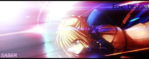 and sorted the text
__________________
|
|
|
|
|
|
2007-06-21, 01:15
|
Link #69 |
|
Retired
Graphic DesignerJoin Date: Mar 2007
Location: Princeton University
|
hehe lots more great sigs again, I expected nothing less from you
Keep up the great work Echo!!! P.S. If you're still mad about that Haruhi one, I apologize again ( I apologized in the thread too)
__________________
|
|
|
|
|
2007-06-21, 01:36
|
Link #70 |
|
Falling for Ginsama ^3^
Graphic DesignerJoin Date: Feb 2007
Location: Airantou
 |
Echo>> NICE SIGS from ya again! xD
I was wondering if u could send me some dark saber renders or pics that u used cuz I was thinking about making a dark saber sig for awhile now. ^^
__________________
|
|
|
|
|
2007-06-21, 05:47
|
Link #71 | ||
|
Senior Member
Graphic DesignerJoin Date: May 2007
|
Quote:
Quote:
__________________
|
||
|
|
|
|
2007-06-21, 16:49
|
Link #72 | |
|
Retired
Graphic DesignerJoin Date: Mar 2007
Location: Princeton University
|
Quote:
__________________
|
|
|
|
|
|
2007-06-26, 17:07
|
Link #76 |
|
Hail pork!
Graphic DesignerJoin Date: May 2007
Location: Silicon Valley
|
Your 2nd version is definately better than the original. Your vector lines compliment your render better plus the light source on the upper left hand corner is a nice addition to your vector style. Keep up with your new style.
__________________
|
|
|
|
|
2007-06-26, 17:53
|
Link #77 |
|
Not an expert on things
Join Date: Jun 2007
|
I think you did a good job on the lighting as well [although I'm bothered that my eyes keep on straying to the top-left].
Anyways, the second one is better than the first in my opinion. The colours you chose for the second one were much better than the first. I feel that the bottom-right side of the signature is kind of empty though. Maybe you can add something dark enough there as to not distract attention but fill space? |
|
|
|
|
2007-06-28, 07:38
|
Link #80 | |
|
Senior Member
Graphic DesignerJoin Date: May 2007
|
Quote:
Currently working on making a gif sig with vector lines now. Hopefully i can make it fit to AS rules. made this for a good friend of mine, was teaching her a few things on photoshop  Collab with WingZero619 
__________________
Last edited by Epsilon; 2007-06-28 at 18:44. |
|
|
|
|
 |
| Tags |
| vector |
|
|