AnimeSuki Forums

Register Forum Rules FAQ Community Today's Posts Search

Go Back   AnimeSuki Forum > Anime Related Topics > Fan Creations

Notices

Reply
 
Thread Tools
Old 2009-06-27, 16:22   Link #201
Chaho-Chi
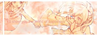
toptoptoptoptoptoptoptopt
*Graphic Designer
 
 
Join Date: Jun 2008
Location: Behind you >:)
Age: 27
Send a message via MSN to Chaho-Chi
I've been off my game lately and I don't know why, I think I need help with this sig.

It's very badly made but I have no clue on how I can improve it...

I also need help on my previous one.

__________________

Chaho-Chi is offline   Reply With Quote
Old 2009-06-27, 17:23   Link #202
bigdave
Falling for Ginsama ^3^
*Graphic Designer
 
 
Join Date: Feb 2007
Location: Airantou
Send a message via AIM to bigdave
*sigh* considering no one visits my thread anymore i thought that i would get some C&C on my recent sig


PS Don't talk about the text, I KNOW its not good but what about everything else :P
__________________
If you want to see more of my sigs go to~ bigdave's sig gallery ~

bigdave is offline   Reply With Quote
Old 2009-06-27, 17:52   Link #203
Endrance
~Rock ☆~
*Graphic Designer
 
 
Join Date: Apr 2007
Location: In The Farplane
Thought id see what comments id get on my current Suigetsu siggy...didnt know how the animation looks so thought id get some c+c on it
__________________
Endrance is offline   Reply With Quote
Old 2009-06-27, 17:55   Link #204
bigdave
Falling for Ginsama ^3^
*Graphic Designer
 
 
Join Date: Feb 2007
Location: Airantou
Send a message via AIM to bigdave
Quote:
Originally Posted by Endrance View Post
Thought id see what comments id get on my current Suigetsu siggy...didnt know how the animation looks so thought id get some c+c on it
hmmm its a bit choppy in certain parts but the sig itself is okay
just try to make the parts near his body a bit smoother ^^
__________________
If you want to see more of my sigs go to~ bigdave's sig gallery ~

bigdave is offline   Reply With Quote
Old 2010-08-25, 22:02   Link #205
Suomi
Kaiba
 
 
Join Date: Jul 2010
Location: David Tennant's bedroom in the TARDIS
I hereby revive this thread..


This is the starting point for a sig. I did a crop/resize and upped the saturation for better color. However: I need a background for it, and I can't seem to find one that fits. Any ideas as to color/design/etc let me know. It's supposed to be artsy but not feminine.
__________________
Suomi is offline   Reply With Quote
Old 2010-08-26, 00:29   Link #206
Mr. Wang
Scholar of Yanderes
*Author
 
 
Join Date: Jun 2010
Location: Haramihama
Send a message via Yahoo to Mr. Wang
Quote:
Originally Posted by Sworn to Believe View Post
I hereby revive this thread..


This is the starting point for a sig. I did a crop/resize and upped the saturation for better color. However: I need a background for it, and I can't seem to find one that fits. Any ideas as to color/design/etc let me know. It's supposed to be artsy but not feminine.
I took a look at your profile, and I think AddiKtioNn-BlaCk asked me to do the same request... Except, the link showed up as a blank page on my computer, and it seems to have worked for you though. I asked him for a different link to be sent to me, though no reply...

In any case, what I would normally do, whenever I look for any background or source for an effect, I always like to go search "abstract art" on google images. Whenever there are moments when I'm uninspired for something, I just know that some certain design needs to go here, I look for abstract art to put into the background. Some editing thereafter can work a long ways to making something look good. In fact, almost every sig I've done, has mostly been removal of a background and cleaning up, then adding abstract overlays. This, for me at least, has served me pretty well...

And I'm pretty sure an abstract background can prove to be very artsy, and not feminine. Just find something that looks nice, tweak around with the colors of it... That's all I can say for right now. I don't exactly have the perfect plans for making sigs, I don't make the best, but it works well enough for me.
__________________
Mr. Wang is offline   Reply With Quote
Old 2010-08-26, 01:32   Link #207
Kudryavka
Senior Member
 
 
Join Date: May 2009
Anybody want to help me resize an image?
Kudryavka is offline   Reply With Quote
Old 2010-08-26, 07:21   Link #208
Star-Wing
Covered in Darkness
*Graphic Designer
 
 
Join Date: Jul 2010
Location: Missing~
Send a message via MSN to Star-Wing
^
What image?
__________________
Star-Wing is offline   Reply With Quote
Old 2010-08-26, 17:36   Link #209
Suomi
Kaiba
 
 
Join Date: Jul 2010
Location: David Tennant's bedroom in the TARDIS
EDIT:
finished product:

blah. I spent like an hour on it...just trying to learn blending...
__________________

Last edited by Suomi; 2010-08-27 at 18:12.
Suomi is offline   Reply With Quote
Old 2010-09-05, 08:42   Link #210
Kaze
「Darkly Charismatic 」
*Artist
 
 
Join Date: May 2008
Location: The Lounge
Finished a new project, have been working on it for some time, almost gave up half-way through because I just couldn't get it right.

This is what I got.


Meh.
__________________
Kaze is offline   Reply With Quote
Old 2010-09-05, 11:56   Link #211
Suomi
Kaiba
 
 
Join Date: Jul 2010
Location: David Tennant's bedroom in the TARDIS
I love the effects, and the hologram-ish style of the cards, and teh shadows/glows, Kaze. Who is it of?
__________________
Suomi is offline   Reply With Quote
Old 2010-09-05, 12:44   Link #212
Kaze
「Darkly Charismatic 」
*Artist
 
 
Join Date: May 2008
Location: The Lounge
Quote:
Originally Posted by Sworn to Believe View Post
I love the effects, and the hologram-ish style of the cards, and teh shadows/glows, Kaze. Who is it of?
Hah, thanks, even though I almost gave up on it

It's from the game I'm currently no-life playing
Persona 3 Portable
to the Right is the main character (yourself)
and the left is his persona, his "inner self".
the 2 cards have a deeper meaning, which I won't bother boring you with if you haven't played the game

*Edit*

The fireworks were bugging me very much, so I changed it

My new version, and I hereby stop working on it

__________________

Last edited by Kaze; 2010-09-05 at 13:28.
Kaze is offline   Reply With Quote
Old 2010-09-05, 16:25   Link #213
Suomi
Kaiba
 
 
Join Date: Jul 2010
Location: David Tennant's bedroom in the TARDIS
Quote:
Originally Posted by Kaze View Post
Hah, thanks, even though I almost gave up on it

It's from the game I'm currently no-life playing
Persona 3 Portable
to the Right is the main character (yourself)
and the left is his persona, his "inner self".
the 2 cards have a deeper meaning, which I won't bother boring you with if you haven't played the game

*Edit*

The fireworks were bugging me very much, so I changed it

My new version, and I hereby stop working on it

sounds interesting! What system is it for
__________________
Suomi is offline   Reply With Quote
Old 2010-09-05, 16:37   Link #214
Kaze
「Darkly Charismatic 」
*Artist
 
 
Join Date: May 2008
Location: The Lounge
Quote:
Originally Posted by Sworn to Believe View Post
sounds interesting! What system is it for
Well, the Original game is on the Playstation 2
But right now I bought the remake of the game for the PSP, so now I'm playing that non-stop

which version of the sig do you like more btw? the first one, or the second one I made?
__________________
Kaze is offline   Reply With Quote
Old 2010-09-05, 21:47   Link #215
Suomi
Kaiba
 
 
Join Date: Jul 2010
Location: David Tennant's bedroom in the TARDIS
Quote:
Originally Posted by Kaze View Post
Well, the Original game is on the Playstation 2
But right now I bought the remake of the game for the PSP, so now I'm playing that non-stop

which version of the sig do you like more btw? the first one, or the second one I made?
Hmm. I'm getting a PS2 (and paying a third of the price!) so I might get it.

The first.
__________________
Suomi is offline   Reply With Quote
Old 2010-09-06, 20:37   Link #216
bloppyblue
SLEEP IS FOR THE WEAK!!!
 
 
Join Date: Feb 2007
Could someone give me pointers on my signature right now? It's the first time I've tried something like it xD

I can't seem to get the colour tone on the Ritsu (left) to match up with Kanbaru (right).
bloppyblue is offline   Reply With Quote
Old 2010-09-07, 05:27   Link #217
felix
sleepyhead
*Author
 
 
Join Date: Dec 2005
Location: event horizon
Quote:
Originally Posted by bloppyblue View Post
I can't seem to get the colour tone on the Ritsu (left) to match up with Kanbaru (right).
Using Photoshop? Just adjust the Levels. Move the white slider (right) inwards. You can also tweak the gray slider (middle) to achieve the same effect.
__________________
felix is offline   Reply With Quote
Old 2010-09-07, 17:04   Link #218
Rennir
Quietly Lurking
*Graphic Designer
 
 
Join Date: Mar 2010
Location: Beneath the prodigious sky...
Quote:
Originally Posted by Kaze View Post
Hah, thanks, even though I almost gave up on it

It's from the game I'm currently no-life playing
Persona 3 Portable
to the Right is the main character (yourself)
and the left is his persona, his "inner self".
the 2 cards have a deeper meaning, which I won't bother boring you with if you haven't played the game

*Edit*

The fireworks were bugging me very much, so I changed it

My new version, and I hereby stop working on it

Left side is very well done IMO. Right side...not so much. If the color of one of the renders is purple, and the other is blue, you can't just do an all/mainly blue bg because the left render will look unnatural in the sig. You want to mix up the bg somehow. Also, another thing is render choice. Personally, if I'm creating a sig with two renders, I would usually use two that are displayed in the same perspective. In your sig, the perspective of the two renders is different. Lastly, decrease the opacity of your c4d because it sticks out too much. Just my two cents . Otherwise it's really great
__________________
Rennir is offline   Reply With Quote
Old 2010-09-24, 09:47   Link #219
Kaze
「Darkly Charismatic 」
*Artist
 
 
Join Date: May 2008
Location: The Lounge
Woaaaaaaah, man was I searching in the wrong section of the forum to find this thread

Anyways, this might be a bit older now, but Star fixed the Persona Sig:


On another note, been wanting to do this one for a while now ever since I found the image.
I tried my hand at smudging again, after all this time!
Spoiler for The New one!:
__________________
Kaze is offline   Reply With Quote
Old 2010-09-24, 20:20   Link #220
Suomi
Kaiba
 
 
Join Date: Jul 2010
Location: David Tennant's bedroom in the TARDIS
The smudging is nice.
...no further comments?
and the persona sig looks better. Nice n' clean.


i got bored, I love purple, and I'd saved a bunch of renders. The purple wavy stuff is a fractal render, which is also what's on the text. (I shall learn to love these)
I know the arm looks funny...clone-stamping issues...tried to fix it but it didn't work. >.<
__________________
Suomi is offline   Reply With Quote
Reply

Tags
discussion, signature


Posting Rules
You may not post new threads
You may not post replies
You may not post attachments
You may not edit your posts

BB code is On
Smilies are On
[IMG] code is On
HTML code is Off

Forum Jump


All times are GMT -5. The time now is 05:21.


Powered by vBulletin® Version 3.8.11
Copyright ©2000 - 2024, vBulletin Solutions Inc.
We use Silk.