2007-06-21, 00:12
|
Link #21 | |
|
Retired
 Graphic Designer Graphic DesignerJoin Date: Mar 2007
Location: Princeton University
|
Still great sigs in production
 I really love your effects on them =] pretty cool. (I can never do that I really love your effects on them =] pretty cool. (I can never do that  ) )Oh well, great job here and hope to see more =] Quote:

__________________
|
|

|

|
|
2007-06-21, 06:07
|
Link #22 | ||
|
Thinking outside the box
Graphic DesignerJoin Date: May 2007
Location: The Netherlands
Age: 37
|
Quote:
I was trying to change my name to Sephi there to but it was registered already. And don't worry about the C4d bigdave, you have come a long way from the days that you made your sig with Paint to your current results. Quote:
So your post belongs in that thread, unless you specifically want me to make a signature with one of my styles. If that is the case i would need a bit more info regarding which style you prefer and what text as i don't know the anime myself and it's hard to give the sig the right feel that way.  Totally forgot about my latest sig Eri Sawachika. School Rumble also holds a special place in my Anime list. And Eri is just  Got some time the next couple of days so hopefully i get the chance to try some new styles. Still hoping to make a batch of Shuffle sigs. But still can't get any ideas for it. Brush or c4d just doesn't seem the right style for it. But perhaps i should give Brushes a try. Thanks for everyone comment 
__________________
Last edited by Sephi; 2007-06-21 at 06:50. |
||
|
|
|
|
2007-06-21, 08:33
|
Link #23 |
|
阿賀野型3番艦、矢矧 Lv180
Graphic Designer Moderator ModeratorJoin Date: Mar 2006
Location: Belgium, Brussels
Age: 37
|
well well, i will simply say : nice blending skills here
 this signature cought my interest : i'm not really fond of the fonts of the texts, but else, the mood, contrast etc are quite a big hit. ^__^ Luckt Star BG and elements are nicely done, they look like genuine except eri sig, i'm not really fond of the us eof C4D in your style in fact : they look rather random and not really fitting the chars. meh, critic aside, i don't really see which skills you have to work hard on, considering the good work here
__________________
|
|
|
|
|
2007-06-22, 03:44
|
Link #24 |
|
Falling for Ginsama ^3^
Graphic DesignerJoin Date: Feb 2007
Location: Airantou
 |
Man I feel dumb now xD
and I think i remember asking bout it already too =__= U know if u asked an admin u could get ur name changed but then u would have to start ur post count all over again. =/
__________________
|
|
|
|
|
2007-06-22, 06:17
|
Link #25 | ||
|
Thinking outside the box
Graphic DesignerJoin Date: May 2007
Location: The Netherlands
Age: 37
|
Quote:
Though the color does represent her in someway, except the green.Quote:
But i'll just keep my name there.Latest  Got tired of C4d and meh.. doesn't seem the right style for shuffle anyway. So finally started with my first shuffle sig. Inspired by some of Klashikari work. As i never use more than 2 renders in 1 sig. Nor do i do small img in sig's often. The middle top felt empty, so i slapped arrows there. And mmm i had a hard time getting the color intensity out. The colors still feel to plain to me. And the eternal problem of fonts and what to do with that, and which font to use... Somehow the sig feels to crowded to :/ Wonder if i should make more sig of shuffle in this style of try a different style again. Critics and comments are welcome about how i can improve the sig. PS... i found out i typed GallEry wrong aaah now it says GallAry on fan section. I even made the same mistake making the banner for my gallery. And i forgot and typed gallAry when making the title. Seems it can't be changed anymore either T.T nOES 
__________________
|
||
|
|
|
|
2007-06-22, 07:04
|
Link #27 | ||
|
♪~ Daydreaming ~♪
Graphic Designer Administrator AdministratorJoin Date: Dec 2005
Location: Italy
|
Quote:
Quote:
 As for your creations, I have to say they're very good. If I had to make a top three: 1. Love the blending2.  Great background, choice of picture and fonts. Great background, choice of picture and fonts.3.  Massively cute character ^^ Massively cute character ^^But I also like that of Saber. As for avatars:  Again this girl is too cute. What's the source? Again this girl is too cute. What's the source? Really soothing Really soothing
__________________
|
||
|
|
|
|
2007-06-22, 09:27
|
Link #28 | |
|
Senior Member

Join Date: Dec 2006
|
Quote:
BTW, Sephi, just love all the Arcueid siggys
__________________
|
|
|
|
|
|
2007-06-23, 05:11
|
Link #29 |
|
Thinking outside the box
Graphic DesignerJoin Date: May 2007
Location: The Netherlands
Age: 37
|
Thanks for editing my thread title. I'm quite thick headed sometimes and just can't get the words right.
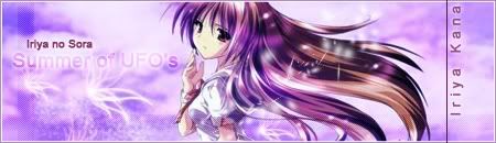
As for the Iriya no sora, noes. The pic was crop and scale. But i added the finishing touches to it. Can't really take credits for it beside for my text and the lines and stuff. And the magical sparkling thingies.... as for the source of the Chibi Arf pics. It's indeed from Magical Girl Nanoha (aS) Here are the stock's. All the pictures came from the Magica Girl Nanoha Image thread Spoiler for kawaiiness overkill:
2 new more shuffle signatures.  Spoiler for named version:
Was messing around a bit. I really wanted to add Primula to it to. But there was no space left for it. Probably gone redo one with 5 girls in it and add Primula. Size will probably be around 500x100 and 90px for each circle for a girl. Wonder which version is better. With or without name? Kaeda signature  Bit hard to read the quote. But mmm couldn't find a smaller font that looks sharper than what i used for the quote of her. And somehow the middle feels a bit to empty. Also made 2 Avatars.  Optimized for Animesuki use  the background color has been changed to that part of the forum. If i left it empty the drop shadow looked weird. the background color has been changed to that part of the forum. If i left it empty the drop shadow looked weird.  Saw a pic with the 6 girls of em, so decided to turn it in to a avatar.
__________________
|
|
|
|
|
2007-06-23, 06:14
|
Link #30 |
|
阿賀野型3番艦、矢矧 Lv180
Graphic DesignerModeratorJoin Date: Mar 2006
Location: Belgium, Brussels
Age: 37
|
i see you have combined some idea from me and capture, not bad choice for shuffle ^^"
as for kaede, yes, i felt the same way : the center is a bit empty : the shuffle logo has too much "placeholder" vibes. be careful with the photograph : some edges are a bit jagged, and you also should be cautious with the shadows : since every photograph has a shadow, they don't look like they are pilled up, but rather floating above each other. Left kaede isn't really blend smoothely, thus the edge seem a bit too sharp (while primula sig didn't have that problem). finally, not really too sure about the text "i love you so, please don't love me" fit the mood here, along with the fonts for both lines. meh asides of these little points, neat looking sig
__________________
|
|
|
|
|
2007-06-23, 08:34
|
Link #31 |
|
Thinking outside the box
Graphic DesignerJoin Date: May 2007
Location: The Netherlands
Age: 37
|
Woa very attentive of you
I didn't thought anyone would notice the slightly jagged edges.Unfortunately i don't have a solution to fix the jagged edges. I tried a bit. But without much good results. I start with just a square and paste the pic in to it. Than i rotate it. Unfortunately during the rotate the edges become jagged. I don't have a other solution except for instantly make the square at the right place. But mmm i don't think i'm capable of drawing a perfect square with the lasso tool. tried to fix the shadow. Well i think i sorta fixed it. Just mmmm it should be the right way now  the floating effect is gone i think. Did left a small shadow though. It would of look odd otherwise. the floating effect is gone i think. Did left a small shadow though. It would of look odd otherwise.Also gave Kaeda a 1 px feather. And played a bit with the levels to make her fit better with the background. And changed the quote. But meh... couldn't do much with the Shuffle logo ^^ Well i moved it down.. and feathered it out Well this is version 2 of Kaeda.  Old one for easier comparison The more i look at it the more jagged the edges become  Just like my dead pixels on my laptop screen Just like my dead pixels on my laptop screen Thanks for the criticism
__________________
Last edited by Sephi; 2007-06-23 at 12:52. |
|
|
|
|
2007-06-24, 15:15
|
Link #33 | |
|
AniMexican!
Join Date: Dec 2005
Location: Monterrey N.L. Mexico
|
Quote:
Good work!
__________________
|
|
|
|
|
|
2007-06-25, 10:12
|
Link #36 |
|
Thinking outside the box
Graphic DesignerJoin Date: May 2007
Location: The Netherlands
Age: 37
|
Ay, i really like the outcome of the Kaeda version to. I might make one of Asa to and hope i can fix the slightly jagged photo edges. Though i'm hoping to make it different than the Kaeda version.
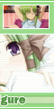
In the meantime i made one of Kagami in same style as my other Lucky Star sig since it's a fairly easy style to do. Will be putting this one up as freebie in the Lucky Star forum soon. Unless someone claims it here. If you want the quote changed, just say so. I couldn't really find a good quote to put there...  Spoiler for 430x120 version:
Might make more of them if people are interesting in seeing a complete set in the same style. But meh, in the mean time i'll just try make a new Shuffle sig with Asa/Sia/Nerine.
__________________
|
|
|
|
|
2007-06-25, 12:21
|
Link #37 |
|
Hail pork!
Graphic DesignerJoin Date: May 2007
Location: Silicon Valley
|
Nice vector job you did on the Kagami sig. I would suggest feathering the left render 1px because her edges are a bit too sharp and placing a very very light drop shadow to give her some depth. As for the render on the right, I would go with maybe a 15% opacity and distance of 2-3 drop shadow. Either than that, this sig is ace.
__________________
|
|
|
|
|
2007-06-27, 08:47
|
Link #38 |
|
Thinking outside the box
Graphic DesignerJoin Date: May 2007
Location: The Netherlands
Age: 37
|
The left Kagami is actually feathered out by 1 already. But i just did it again for smoother edges. Did the drop shadow on the right Kagami. But i left out the drop shadow on the left Kagami since it looked a bit weird.
Thanks for your comment m8. Well, heres a Asa signature. 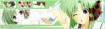 The green for the background was a pain to choose... And something seems missing at the left of the hello arrow. And meh, should i make a Sia one, it will have round edges... Also animated it... But it turned out pretty ugly and silly Spoiler for lol...:
Criticism and comments are welcome.
__________________
|
|
|
|
|
2007-06-27, 09:02
|
Link #39 | |
|
Sexy Tornado
ArtistJoin Date: Dec 2005
Location: The European Bunion
Age: 45
|
Quote:
|
|
|
|
|
|
2007-06-29, 03:05
|
Link #40 | |
|
Thinking outside the box
Graphic DesignerJoin Date: May 2007
Location: The Netherlands
Age: 37
|
Quote:
 Sia signature. Making the wave like things at top and bottom was a pain. Been awhile since i played with pen tool and anchor points. And in the end i ran out of ideas and smacked arrows at left. But since that looked like a placeholder... I decided to smack that square with Sia name in Japanese there. Though it still looks like a placeholder... The color was a pain to. Almost as hard as choosing Asa colors. Well, since i came this far already one last of Nerine will come to.
__________________
|
|
|
|
|
 |
|
|