2010-08-10, 22:26
|
Link #63 | |
|
Kaiba
Join Date: Jul 2010
Location: David Tennant's bedroom in the TARDIS
|
Quote:
__________________
|
|

|
|
2010-08-10, 23:26
|
Link #64 | |
|
Scholar of Yanderes
 Author AuthorJoin Date: Jun 2010
Location: Haramihama
  |
Quote:
__________________
|
|
|
|
|
2010-08-11, 17:33
|
Link #65 | |
|
"Show it to me"
Join Date: Dec 2005
Location: In solitude, where we are least alone
|
Quote:
 ^ Alright, moved it on another spot. Seriously, where do I need to put the text to make it not be a distraction? 
__________________
|
|
|
|
|
2010-08-11, 18:03
|
Link #66 | |
|
「Darkly Charismatic 」
ArtistJoin Date: May 2008
Location: The Lounge
|
Quote:
 What I would do is, type the text in the direction of the arrows and a bit smaller size 
__________________
|
|
|
|
|
2010-08-11, 18:12
|
Link #67 | |
|
"Show it to me"
Join Date: Dec 2005
Location: In solitude, where we are least alone
|
Quote:
__________________
|
|
|
|
|
2010-08-12, 03:56
|
Link #73 | ||
|
Call me MK! :)
Graphic DesignerJoin Date: Oct 2009
Location: The top of the world.
Age: 34
|
Quote:
 Quote:
__________________
Last edited by milan kyuubi; 2010-08-12 at 04:46. |
||
|
|
|
2010-08-12, 06:18
|
Link #74 |
|
Scholar of Yanderes
AuthorJoin Date: Jun 2010
Location: Haramihama
|
@ Cyz
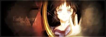
Well... let's just say I like what I see so far...  Also, Kaze made a great suggestion. If you can manage that, I don't think the text will distract us from what's supposed to be the distracting characteristic... Also, Kaze made a great suggestion. If you can manage that, I don't think the text will distract us from what's supposed to be the distracting characteristic... @ Geki Interesting sig, and good for the theme... though she creeps the hell out of me...  @ Mittwoch Colors have been vivified, which is great... however, I somehow think the colors look... faded somehow. Something I found more prevalent in the previous version. It's a phenomenal signature, though the colors personally irk me just a tad. @ Namiey Great signature, and an almost haunting feel in a dimly lit setting. Though, the only difference I see in the versions is simply a black border has been added to the second. For what it's worth, I suppose the black brings out and makes the sig pop out. @ Milan Kyuubi Version 4 has the colors more vivified, and the text is nicely positioned in a way that makes it noticeable, though subtle enough not to distract from the rest of the image. However, I'd recommend a more... fitting font style. What that style is, I have no clue. Maybe just a personal preference, but I would emphasis the dividing line between the girl and the source of reflection a bit more, or make the mirror just a bit more obvious. However, details and colors have a subtle tone to it, so my idea might just break that. And we wouldn't want to break that harmony, would we? I don't have much to say about the other sig at the moment, other than I like your other signature better.
__________________
|
|
|
|
2010-08-12, 19:01
|
Link #77 | ||
|
Scholar of Yanderes
AuthorJoin Date: Jun 2010
Location: Haramihama
|
Quote:
 Quote:
__________________
|
||
|
|
|
2010-08-13, 08:29
|
Link #79 | |
|
Senior Member
ArtistJoin Date: Mar 2009
Location: Normandy SR-2
Age: 29
|
Quote:
__________________
|
|
|
|
|
2010-08-13, 09:27
|
Link #80 |
|
Covered in Darkness
Graphic DesignerJoin Date: Jul 2010
Location: Missing~
 |
@Namiey - I liked the version 2
@Solace - Beautiful entry; liked it a lot. But as Halad already said, it does look a bit too bright in the middle. Also, maybe making the eyes stand out more might make it more attractive @Milan - Try adding a couple of photo filters; it will tone down the brightness and give a beautiful shade too. Even gradient (maybe of black and light purple/pink) might help too; otherwise the sig is coming out nice. Same with your new try; toooo bright; use the brightness/contrast to bring it down. @geki - Simple but lovely. @Mittwoch - I don't think it needs more work now  Here's my version 2  C&C, please. Spoiler for for previous version:
__________________
|
|
|
 |
|
|


 Moderator