 2007-08-17, 02:45
|
Link #45 | |
|
hiatus almost permanent
Join Date: Apr 2007
|
^^ thanks for the wishes, once again!
- I actually tried a bit of colouring yesterday, after not doing so for about 2 months... It's pretty weird... Sketch used (random character off my head) 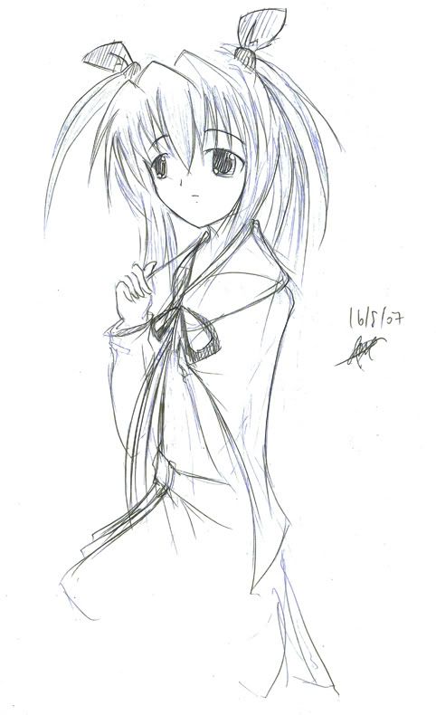 In the end I didn't really colour the whole thing because I was lazy, and because the result was turning pretty bad.  I think I would try something else tomorrow, perhaps a vector or something D:. Quote:
I don't know who the character is. Because I wish not to commit the crime of double posting, I'd be editing this post. Hopefully it'd be seen >_____> here's the vector... I'm working on it halfway. *removed progress, wallpaper on next post* Original pic: 
Last edited by innominate; 2007-08-22 at 13:53. |
|

|

|
|
2007-08-22, 13:26
|
Link #46 |
|
Thinking outside the box
 Graphic Designer Graphic DesignerJoin Date: May 2007
Location: The Netherlands
Age: 37
|
Nice tracing going there. You got a good thing with the eyes. I like the eyes in your trace more than the original one. Very nice nice.
And thanks for the help with my trace.
__________________
|
|
|
|
|
2007-08-22, 13:39
|
Link #47 |
|
hiatus almost permanent
Join Date: Apr 2007
|
Hurrah! I escaped the woes of double posting, fufufu! xD
Sephi you're welcome, and thanks for the bump. 1024x768 imageshack link  photobucket link because imageshack is down, now. 3:07am gmt+8 23/08/07 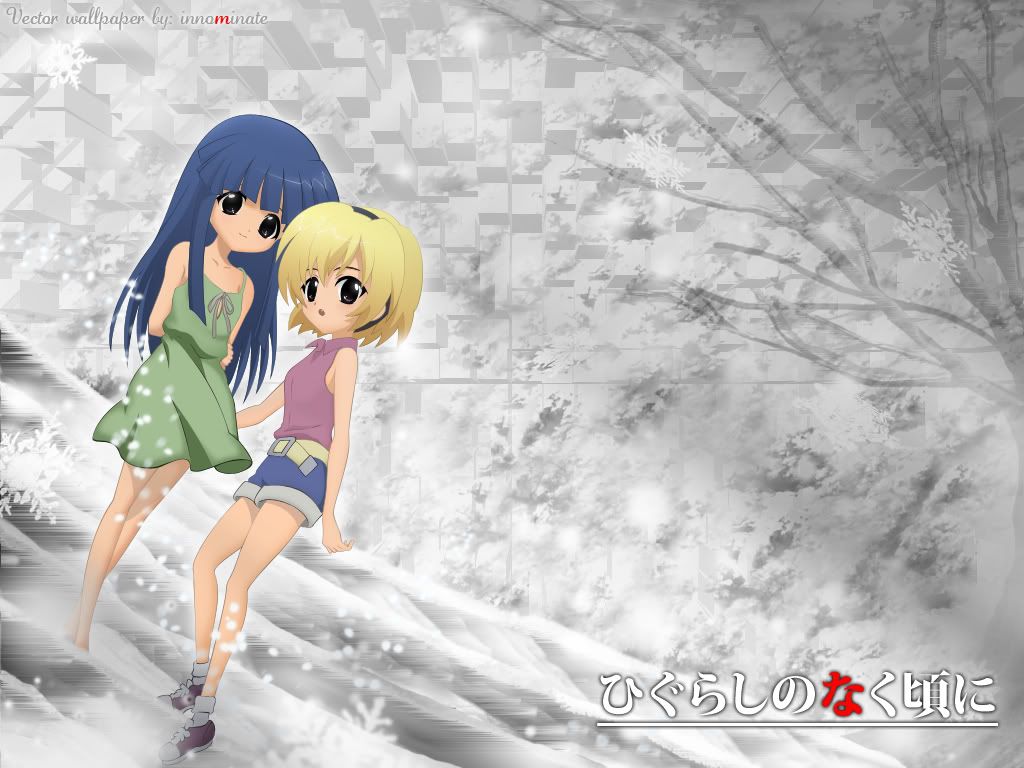 I believe this is somewhat my third vector. I know I said I didn't think I would be vectoring anymore but again I always think wrong. Time spent: Vector- 14 hours D: Bg- um, I lost count. Oh, and, I had to shift all my icons to the right, sigh. >< png-ish: Might be subject to editing, because flaws are apparent. D: Oh yes, this is also the first time I'm using innominate to label my work. haiz, something's wrong. Last edited by innominate; 2007-08-22 at 14:07. |
|
|
|
|
2007-08-22, 15:13
|
Link #50 | ||
|
AniMexican!
Join Date: Dec 2005
Location: Monterrey N.L. Mexico
|
Quote:
 Smooth lines and good use of colors; You certainly need to keep vectoring, you are a natural for this.  Oh, and you used gradients for the hair colors, right? Oh, and you used gradients for the hair colors, right?The background for the wallpaper is very nice, but when you changed the size of the vector to make it fit the wallie, it really affected the quality of the image. IMHO, you should make another wallie using the natural size of the vector (i.e: 1600 x 1200) to prevent the quality loss. I am pretty clueless when it comes to this but, you are supposed to be able to change the size of a vector without any quality loss, so take my comment with a grain of salt here. >_< !! Quote:

__________________
|
||
|
|
|
|
2007-08-23, 10:47
|
Link #51 | |||
|
Thinking outside the box
Graphic DesignerJoin Date: May 2007
Location: The Netherlands
Age: 37
|
Quote:
 But you said The trace is a torture. Is that a hint you tried it  ? ?And meh ~~ the windows here are to small to jump out of... But i got a balcony! Quote:
Oh noes.. i twisted my ankle !! USODA !!! But on a more serious note I think innominate just used shading for the hair, or if you are talking about the zig zag line in the hair? Not sure how innominate did that. I would guess it's a outer glow. Or something with feathering and shading. Quote:
And mmm, make the vector bigger innominate, you can always make it smaller if you think it's to big
__________________
|
|||
|
|
|
|
2007-08-23, 12:25
|
Link #52 | |
|
Senior Member

Join Date: Dec 2006
|
Quote:
__________________
|
|
|
|
|
|
2007-08-23, 14:49
|
Link #53 | ||
|
AniMexican!
Join Date: Dec 2005
Location: Monterrey N.L. Mexico
|
Quote:
Quote:
You can tell this by the way the color fades/changes. It really stands out in Satoko's case.
__________________
|
||
|
|
|
|
2007-08-23, 16:28
|
Link #54 | ||
|
Thinking outside the box
Graphic DesignerJoin Date: May 2007
Location: The Netherlands
Age: 37
|
Quote:
Quote:
Now that i stared at it... Rika hair is missing a few lines. The hair at her back, just above her shoulder. And Satoko is missing her bag but you could of left that out on purpose since it wasn't adding much to it. But i do think the hair at her back of her head is important.
__________________
|
||
|
|
|
|
2007-08-24, 02:31
|
Link #56 | ||||||||
|
hiatus almost permanent
Join Date: Apr 2007
|
Quote:
Quote:
Quote:
For now I shall mull around the ground floor. Quote:
Quote:
&bigdave, first time talking to you x) hello~ Quote:
D: ; But I felt the lines at the back of rika's hair was unnecessary though =) Quote:
Quote:
 And, mmhmm!; I replied: hair colours >> gradient. The shiny line on the hair... Vectorshape + outerglow I forgot what I did for the background already, though... just alot of filters and brushes... T_T Hmm, someone told me the bg looked too cluttered, so I uploaded versions without the weird patterns in the background. Now it looks plainer. ^^ &you can see the ugly tree D: Ran out of superlatives. Um, to name the file, that is xD & thanks for all the comments at any rate xD |
||||||||
|
|
|
|
2007-09-05, 23:58
|
Link #57 |
|
Gregory House
IT SupportJoin Date: Jun 2006
Location: Buenos Aires, Argentina
Age: 35
 |
I liked the style of writing on the Drift story... I can tell it has a purpose, and I like that, too. It's cryptic, though, which is not something good or bad by itself. Just cryptic
__________________
|
|
|
|
|
2007-09-06, 02:20
|
Link #58 |
|
hiatus almost permanent
Join Date: Apr 2007
|
Haha, thx Wk... ^^
And I am really going to hope someone replies so I'd take my chance with this update... #1 Fiction!~ xD It's probably the only thing I feel is worth viewing in this thread. Of quantum immortality http://www.fictionpress.com/s/2411735/1/ - #2 (removed) - #3 D= blearrgh. This picture is quite fail. I feel sorry for the character. -(removed) - #4 Remember the book cover I did some time ago... well... it was anime related so it got rejected. So I redesigned it:  - Oh yeah, and lastly... it's quite obvious... but I've changed my signature:  ^^" Last edited by innominate; 2007-10-09 at 22:29. |
|
|
|
|
2007-09-06, 05:18
|
Link #59 |
|
Thinking outside the box
Graphic DesignerJoin Date: May 2007
Location: The Netherlands
Age: 37
|
#2.
You can just save it as PNG-8 or gif if you want to keep it within 50kb. I doubt it has over 256 colors, so you probably won't lose quality. #3. Don't think it's that bad. Only Yumemi facial expressions isn't as good as the original one. #4. I liked the old one more. But to bad it got rejected. The new one is still very nice. I'm just not to found of how the books look in front, but that is just meh.
__________________
|
|
|
|
 |
|
|


