2009-12-28, 20:59
|
Link #121 | |
|
Manga Addict
Join Date: Sep 2009
Location: England, UK
Age: 32
 |
Quote:
 @katiemirmo the sprays are for a number of games on Steam, for example Left 4 Dead and Counter Strike Source. You can set a certain image as your 'spray' of which you can spray onto walls and the floor for example. |
|

|

|
|
2009-12-28, 23:22
|
Link #123 | |
|
The Shadow of Twilight
 Graphic Designer Graphic DesignerJoin Date: Sep 2008
Location: Cursed land.
 |
Quote:
 then I would have this as a result 
|
|
|
|
|
|
2010-01-05, 09:38
|
Link #128 | |
|
The Shadow of Twilight
Graphic DesignerJoin Date: Sep 2008
Location: Cursed land.
|
Quote:
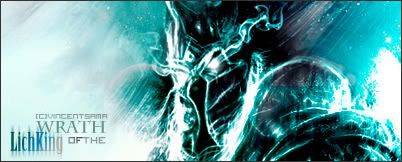
as my come back, there's a new update today  And the sig Zepar & Furfur was made for my friend. Since he's still using it so no one can claim them till he gave up on it.  The one below is cropped & optimized version.  btw, thanks for everyone has supported me till now. I really appreciate your feelings 
|
|
|
|
|
|
2010-01-15, 09:06
|
Link #130 |
|
The Shadow of Twilight
Graphic DesignerJoin Date: Sep 2008
Location: Cursed land.
|
thanks for cookies, Eps~
 My new update. Without delays  . . . . . . With delays  . . . . . . Others  . . And the sigs    This one was made for someone's request. Too bad I forgot to edit before quitting my PS so it was a pity that I couldn't erase the username  anyways, Momiji & gundam sig are ones of the worst i've made ;___; |
|
|
|
|
2010-01-25, 11:50
|
Link #135 | |
|
Manga Addict
Join Date: Sep 2009
Location: England, UK
Age: 32
|
Quote:
 On a side note, this is very nice indeed; Nice work
|
|
|
|
|
|
2010-01-25, 15:09
|
Link #136 | ||
|
The Shadow of Twilight
Graphic DesignerJoin Date: Sep 2008
Location: Cursed land.
|
Quote:
Quote:
anyways, my new update. Some are not in AS's safe since they're supposed to be used for another forum Ava
 . . . .   Sigs  . .  |
||
|
|
|
|
2010-01-25, 15:12
|
Link #137 | |
|
The Interstellar Medium
AuthorJoin Date: May 2008
Location: [SWE]
Age: 34
|
Quote:
__________________
|
|
|
|
|
|
2010-01-25, 15:20
|
Link #138 |
|
Artist wannabe
Join Date: Jan 2010
Location: Sweden
Age: 30
 |
Beautiful sigs, love the contrast and how you use the colors, and the fonts O_O! You really make both the pictures and the text fit so well!
Jumped right to the last page, but I'm going to read it all from page 1 =] |
|
|
|
|
2010-01-25, 15:28
|
Link #139 | ||
|
The Shadow of Twilight
Graphic DesignerJoin Date: Sep 2008
Location: Cursed land.
|
Quote:
Quote:
Honestly I have to say it was unexpected that that work somehow turned out very good even though at first step I was kinda dissappointed at it I thought I was gonna make a big failure like previous gundam sig at that time.
|
||
|
|
|
|
2010-01-25, 18:26
|
Link #140 | |
|
~La-la Land~
Graphic DesignerJoin Date: Jul 2007
Location: Seattle
Age: 37
|
Quote:
I especially like your Gin-sama sig: the colors, the lighting, the whole feel of it all. The 3rd is quite nice as well with your extremes on light and dark. I wasn't such a fan of the first, your entry for this month's sig competition, in large part because I feel like the render blends in too much with the background. She sorta gets lost in it all and the theme isn't emphasized. Text on all three: superb. I used to not like your text use on your earlier works, but now you have it down to an art.
__________________
|
|
|
|
|
 |
|
|


 .
. .
. .
. .
. .
.