2010-11-08, 21:25
|
Link #43 | |
|
Strangely dependable...
Join Date: Nov 2006
Location: some random place out there...
|
Quote:
__________________
|
|

|
|
2010-11-09, 00:07
|
Link #49 | ||
|
女人最大~~
Join Date: Sep 2010
Location: Chibiland <(^-^)>
|
Quote:
IMHO, however, it could use some extra colour effects. Try using a lighting c4d on the background, to make a glowy effect on the upper half and a dark bottom half (keep the text on the bg tho). I would also add a yellow/white linear gradient on overlay to lighten it up a bit (erase the gradient parts which makes the sig's colours look wierd tho). Quote:
__________________
Last edited by Reonikki; 2010-11-09 at 00:20. |
||
|
|
|
2010-11-09, 02:37
|
Link #50 | |
|
Join Date: Aug 2010
Location: In Wonderland with Alice
|
Quote:
__________________
|
|
|
|
|
2010-11-09, 04:48
|
Link #51 | ||
|
~La-la Land~
 Graphic Designer Graphic DesignerJoin Date: Jul 2007
Location: Seattle
Age: 37
|
Quote:
Quote:
These concepts may be difficult to grasp and portray in a sig, but I think you guys are capable of it if you try. Take the time to look into the steampunk or cyberpunk cultures so you have a better idea of what they entail. If your sig just has some random character plugged into some wires or machine, yet lacks any connection to the type of society associated with "cyberpunk," then I suggest re-thinking the sig's approach to the theme. Link to Wiki's list of cyberpunk works (literary, film, animation, etc.). I don't agree with all of them as some go into interplanetary travel and super-future technology instead of the near-future Earth, but it's a good start.
__________________
Last edited by Marina; 2010-11-09 at 05:00. Reason: included link |
||
|
|
|
2010-11-09, 17:52
|
Link #52 |
|
Senior Member
ArtistJoin Date: Mar 2009
Location: Normandy SR-2
Age: 29
|
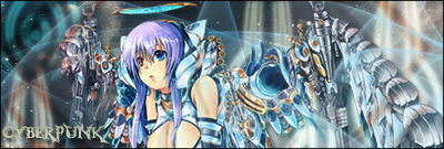
I agree that a lot of entries are missing the 'punk' feel. Is mine alright? It's not from a cyberpunk anime but I thought it gives off the atmosphere of one, especially those wires hooking up to the guy....
Third try.... I tried adding lighting, any comments? Wait... the bottom looks too dark now... arghh...  Spoiler for ver. 02 for comparison:
__________________
|
|
|
|
2010-11-09, 19:05
|
Link #54 | |
|
Join Date: Aug 2010
Location: In Wonderland with Alice
|
Quote:
But adding to that, Haladflire, I don't think your light source is fitting - it sticks out, maybe try a light color from your sig instead of white. Also, the sig kinda remained dark even with the lighting - maybe lighten it a,lil?
__________________
|
|
|
|
|
2010-11-09, 19:32
|
Link #55 | |
|
books-eater youkai
Join Date: Dec 2007
Location: Betweem wisdom and insanity
|
Quote:
@Haladflire65, I an not sure than the text is needed for this one.
__________________
|
|
|
|
|
2010-11-09, 19:33
|
Link #56 | |
|
Strangely dependable...
Join Date: Nov 2006
Location: some random place out there...
|
Quote:
On another note, I don't see a lot of steampunk attempts. 
__________________
|
|
|
|
|
2010-11-09, 19:35
|
Link #57 | |
|
books-eater youkai
Join Date: Dec 2007
Location: Betweem wisdom and insanity
|
Quote:
__________________
|
|
|
|
|
2010-11-09, 20:24
|
Link #58 |
|
女人最大~~
Join Date: Sep 2010
Location: Chibiland <(^-^)>
|
Steampunk, IMO, is probably the harder theme of the two. Personally, I found it harder to enhance pictures containing steam, without removing the steam.
 Besides, Victorian/Edwardian era clothing are boring to look at in a sig. Besides, Victorian/Edwardian era clothing are boring to look at in a sig.
__________________
|
|
|
|
2010-11-10, 00:23
|
Link #60 | ||
|
Strangely dependable...
Join Date: Nov 2006
Location: some random place out there...
|
Quote:
This month's a real challenge.Quote:

__________________
|
||
|
|
 |
| Tags |
| contest, signature of the month, sotm |
|
|


 Sexeh sig by Patchy <3©Judy/JuJuBeez
 :|::|
:|::|