 2006-06-19, 17:49
|
Link #1 |
|
Member
Join Date: Jun 2006
Age: 34
|
KH2 Fanart ^_^
Hi im new here actually, and I love to draw so i thought i could post some of my art up. Um you can say what is wrong with my pictures, and if you dont like them thats fine but tell me why and what i should fix. I really dislike argh its horrible comments cuzz that is no help to me.
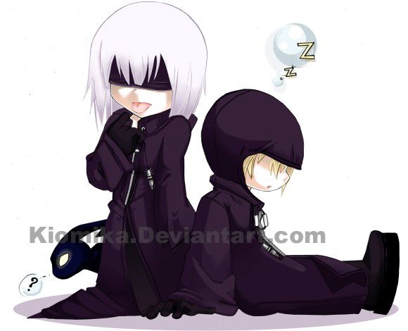 Unknown Riku 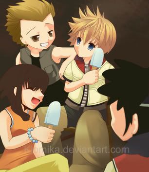 Roxas and his friends 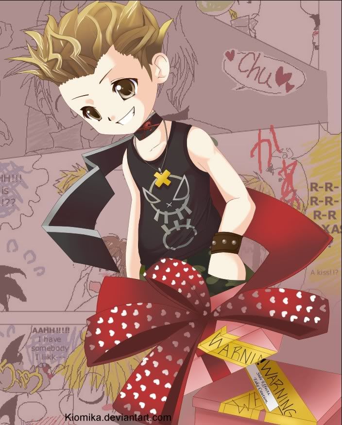 gift art for her friend..the bg is her comic New:  http://Kiomika.Deviantart.com Last edited by Kiomi; 2006-07-29 at 00:52. |

|

|
|
2006-06-20, 01:51
|
Link #4 | |
|
Member
Join Date: Jun 2006
Age: 34
|
Quote:
|
|
|
|
|
|
2006-06-20, 05:45
|
Link #6 |
|
another procrastinator
Join Date: Jun 2006
Location: Sydney, Australia
Age: 37
  |
Really nice work you got there.
Just one thing though.. I'm not too sure about what you've done with the hair on the third picture. I don't know - it just doesn't match the way you've coloured everything else. It would be heaps nicer with the hair you've got in the second picture (on the blue-eyed boy). I really like that one. =) |
|
|
|
|
2006-06-20, 12:40
|
Link #7 |
|
Member
Join Date: Jun 2006
Age: 34
|
d
Thank! Um yeah that hair.....The guy i was drawing from has crazy curly hair, so I ended up getting angry and just keeping it looking like that (back of the hair is off like it has huge chunks of gell in it and the shading isn't clean)... *sigh* tried to do a different Technique, didn't work out ><. Oh well Thanks ^^
|
|
|
|
|
2006-06-20, 18:05
|
Link #8 |
|
Struggling Artist
Join Date: Dec 2005
|
I think the hair coloring is just fine, it really works for his super-spiked/gelled hair. I played KH2, and that really does a good job of matching his look. (Now, if I could just remember his name! Stupid brain....)
My only issue with his hair is that, and I hope I can describe this understandably, the crease of his hairline against his forhead, his "widow's peak," if you will, is off-center. It kinda pulls to the picture's right. Other than that, I know the kind of posture you'e trying to draw, but without pulling his shirt in a bit tighter against his back, it just made him look somewhat pot-bellied, and every Nomura character is slim and trim. Also, his legs disapear instead of continuing behind the present. Overall, I like the second picture best, though Olette's face is kinda weird. (Sure, I can remember her name...) It's got a nice composition and a twilight town-appropriate color scheme. The first is nice too, but not quite as attention-grabbing. And though it so isn't Riku's style, I like how he's sticking his tongue out. It's funny. So, I realize I'm a bit more critical this time, but really, I criticize because I love! |
|
|
|
|
2006-06-21, 21:50
|
Link #9 |
|
Kairin-chan's #1 Fan
 Artist ArtistJoin Date: Jul 2003
Location: Canada
|
Hello there.
It's always nice to see new art around here, and your art is really well done. I see you're going with the chibi style rather than the more realistic kind. And that's fine *points to my avatar* chibi is good.  I would have to say my fav. would be the first picture. Looks pro to me. and I love that black thing with the question mark...whatever it is.  Mmm...what can I say. Everything looks good. If I had to comment on anything I would suggest trying to make your shadows contrast more. This is more or less a preference rather than a critique. Anyways post some more!
__________________
|
|
|
|
|
2006-06-22, 02:41
|
Link #10 |
|
OK.
Join Date: Nov 2003
Location: The Fields of High Attus
Age: 34
|
I think you've got great colouring skills, it really looks very influenced by the Japanese/Korean style of colouring (the soft and hard bits together) - and you got the same kind of colour and lines.
But while the style of drawing is not necessarily my cup of tea, I think you could improve on the poses a bit. In the 2nd picture the hand of the girl holding the lolly looks weird. Also her shoulders could, I think, be modified so that it looks more natural - it looks too stiff. The 3rd picture also looks kind of stiff to me... perhaps it's the fault of the style, but I do think it would help if you had him look somewhere. Currently he looks like he's looking forward and at the side both. Maybe it has to do with the way his face is turned (or not turned). I guess his left eye (from his pov) could be shifted slightly? I think it would make all the difference. I think you're pretty good at the colours though. (Looking at it from a 6500K monitor setting.) Sorry I sound so critical.
__________________
|
|
|
|
|
2006-06-22, 14:05
|
Link #12 | |
|
AniMexican!
Join Date: Dec 2005
Location: Monterrey N.L. Mexico
|
Quote:
Kiomi's drawings are extremely well done.  I specially like the eyes of the character in the last pic.
__________________
|
|
|
|
|
|
2006-06-22, 16:14
|
Link #13 | |
|
Senior Member
Join Date: Jun 2006
Age: 34
|
Quote:
|
|
|
|
|
|
2006-06-22, 16:18
|
Link #14 | |
|
Member
Join Date: Jun 2006
Age: 34
|
Quote:
|
|
|
|
|
 |
|
|


 And about the hayner picture, did roxas kiss hayner in the background?