 2016-07-03, 03:55
|
Link #306 | |
|
The Voice of Reason
Join Date: Feb 2010
Location: The Netherlands
Age: 47
|
Quote:
If you did, you wold have known it's an optical illusion, caused by how our brain interprets shapes.
__________________
|
|

|

|
|
2016-08-15, 12:16
|
Link #308 |
|
sleepyhead
 Author AuthorJoin Date: Dec 2005
Location: event horizon
|
http://thetruesize.com/
The video doesn't explain exactly what "Mercator Projection" means. In laymen's terms it's tacking a giant cylinder, sticking the sphere (our earth in this case) in the middle, then drawing the map on the cylinder as if looking though it to the globe inside. 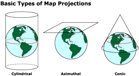 As you can imagine it gets more "stupid" the closer you get to poles, and it's not really meant for people to use as a basis for "comparing sizes" of things on the map. - There's a few other ways to do it of course. Imagine the earth was composed of a lot of flat surfaces. Now imagine we just unfolded it. When you do that you get a Dymaxion Map. It's not perfect, but it puts into perspective both the relative sizes better as well as how connected the continents actually are. Africa is pretty big isn't it? Incidentally the population of Africa is 1.11 billion. By comparison Europe is 742.5 million, China is 1.357 billion, USA 318.9 million, South America is 387.5 million, India 1.252 billion, and Russia is 143.5 million.
__________________
|
|
|
|
 |
|
|


