 2011-03-24, 04:49
|
Link #18222 |
|
Banned
Join Date: Feb 2004
Location: Abstract Side of Reality
Age: 35
|
ganbaru: 5/10 Mostly because I hate mutated vowels. Colors are nice though!
Yorg: 6/10 because it's not a bad signature, but it is for Coheed & Cambria so -4 Rennir: 10/10 because Lightning is awesome. fallschirmjager: 10/10 because it's creative and not a complete rectangle. Dist: 1/10 The lines on the side really do your signature no justice. Also the character in the middle takes up too much room and covers the best part of your signature, that being the background of it. Last edited by delirium; 2011-03-24 at 05:05. |

|

|
|
2011-03-24, 04:52
|
Link #18223 | |
|
レベル 告片
 Graphic Designer Graphic DesignerJoin Date: Jun 2008
Location: 告片
 |
Quote:
Spoiler:
|
|
|
|
|
|
2011-03-24, 06:33
|
Link #18226 |
|
Senior Member
ArtistJoin Date: Mar 2009
Location: Normandy SR-2
Age: 29
|
@Yorg and delirium - Just a friendly reminder that when you post in this thread, you have to rate at least one signature!
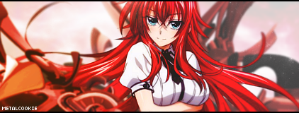
MC: I like  8.8/10 8.8/10Yorg: I like the typography... 8.7/10 delirium: The image could be better quality and I'm not sure how well the purple fits.
__________________
|
|
|
|
|
2011-03-24, 23:09
|
Link #18230 | ||
|
Banned
Join Date: Feb 2004
Location: Abstract Side of Reality
Age: 35
|
Quote:
Spoiler:
Quote:
Spoiler:
lftmatt: 10/10 |
||
|
|
|
|
2011-03-25, 18:27
|
Link #18237 |
|
Member
Join Date: Mar 2011
Location: Chicago, IL
Age: 44
   |
oooh good point...I realize Temari and Sakura's shadow are opposing...right...will fix that!
ganbaru...I got a 9.2/10 little hard to read text...BUT I like the style and font of the text FIXED: That looks MUCH better...thanks for the suggestion...that's why I always transparencies :-p -Kyo
__________________
|
|
|
|
 |
| Tags |
| rate, signature |
|
|


 Anyways, nice quality