2006-12-11, 07:14
|
Link #41 | |||||||||||
|
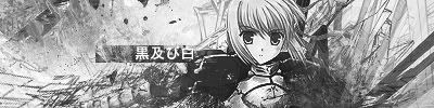
阿賀野型3番艦、矢矧 Lv180
 Graphic Designer Graphic Designer Moderator ModeratorJoin Date: Mar 2006
Location: Belgium, Brussels
Age: 37
|
no i'm not dead, in fact, i was terribly busy these times around, duh
 Quote:
the fake transparency is gone (which is good) while the opacity of the center saber and the text is pretty wrong. also, the jagged black area is really conflicting too much with the font style. Quote:
the text gives the impression that you are using it as a placeholder since you put it twice. (what about splitting black lagoon in 2 ?) the top right hair is finally "smooth" with the sig. Quote:
2) there is a weird yellow line just above the "kina" (around the hair edge) 3) just like BCXIII said, her... butt isn't really looking good (it's plain disproportionned.) 4) the BG is well done, while i suggest you to clean a bit around the BG CC face (especially her mouth) you should change the main picture (the contrast isn't really looking good in fact) and the brush leaves really too much grains and leftover (it is the same style you used with the previous red ecchi signature?) Quote:
i dunno why, but the little... fairy (?) at the right is a bit... strange. in fact, what about swapping its position with the text "riker" ? that would make "some sense" but, that's me you know nothing much to criticize, ecept maybe very slightly the upper edge of the characters. Quote:
the upper edge of both pictures suffer some goofy cut (especially the left picture), while the other parts of the pictures are fine. the signature suffers from some balance issue (you have 2 big picture cuttlering the most space available, which is improving the impression of placeholder) and finally, the text is insanely hard to read, and i'm not really fond about the colour and style choice :s sorry if i was a bit blund/harsh >_> Quote:
the text says "Schwertkreuz" meaning "Sword Cross" (this is the cross device name of hayate) i guess the problem to read this is most likely because it is in german and the original font (animesuki's "unsteady") doesn't give a lot of space between each letter. but i really feel it isn't THAT hard to read... maybe Quote:
really? oO i guess the transparency didn't help enough... the problem with the cross is... it is part of the "nanoha signature" structure, just a copy cat of the 2 others XD i can probably shrink it a bit. Quote:
but i will try to look at it (if i can XD) Quote:
i didn't want to cuttlering the sig too much with the lines, because of the BG in fact. i would try some added features but i'm not really fond with the feeling about this ^^; Quote:
i agree, this is a problem : i will change the transparency and the merging type Quote:
2) the transparency is really neat, no need to change it  3) while the font style and size is nice, i don't really get the link between the text and the picture. (side note : isn't supposed to be "equal" without the a after the e ?) as for me, i will try to fix some issues with the hayate sig. i'm trying to do the chrono sig, but i guess i will simply give up (this is really a pain... it is impossible to find a "good looking" art WITH a nice pose... this is the side effect of (loli)shoujo focused anime... the guyes aren't really covered by the fanbase *sigh* )
__________________
Last edited by Klashikari; 2006-12-16 at 13:45. |
|||||||||||

|

|
|
2006-12-11, 21:55
|
Link #42 | ||
|
Kira_Naruto, the ecchi
Graphic DesignerJoin Date: Dec 2005
Location: http://www.exciting-tits.com/
|
@ CXC  :- Why oh why the choice of color ?  :- Whats the black thing in the mid? :- Fate-chan gets in the way of the face .. bad placement/size :- So very empty BG... Gradient coloring works in combo with something (ie brushing/filters).. never alone IMO. :- If you have 2 stock image.. use only one to blend with BG.. You have both under the BG color = not good at all :- VERY bad artifact on the right ...its painfull ==== @ BC     Lol.. really a pain if your replying in quick reply lol too many image to copy >.< :-I love your transparency skillz.. honestly, I cant get that smooth effect to work =/. :- logicly, she's a Spiderman family member ain't she, because no way, can peoples hang like that .. Lying maybe, but lying upside down? .. just nitpicking here :- Nudge the quote to the right maybe? So it lines up with the sig above? right now it starts under the transparency .. :- Klashi already noted the typo there.. no a after e in equal ==== Quote:
.. there's a bit of melancholic feel, thats why I lose the smoke... ruins the whole feel.. right now, it gives a vibe of ... she's in deep thinking of something.  Which text you refering? For the black lagoon .. its supposed to be in the BG.. its still readable.. yet its obscure in the BG.. and it gives a nice effect IMO.. since my BG is quite empty otherwise ..Also, put something in there besides the text and the mood change.. totally >.< For my name yes.. its a duplicate layers, kinda nice embedded effect dont you think? Simple too .. Put 2 layers of text in black and (white in the other layer) then switch both layers to softlight blending.. nudge one of the layer .. on busy BG, it blends really well, and painfull to delete for sig thief Quote:
and (3) that the source image fault =x Also, BC did mentioned about the foreground CC aint smooth .. but then again .. she's on a couple of artistic filter.. I guess artistic filter dont work too well on anime char ==== btw, okairii Klashi ^^ EDIT2:  .. ..There's a tad bigger version .. I cant get myself to lower the color count >.< 
__________________
Last edited by KiNA; 2006-12-12 at 01:15. Reason: defending my sig ;_; ,2nd edit .. added a new sig ^^ |
||
|
|
|
|
2006-12-12, 07:44
|
Link #43 |
|
sleepyhead
AuthorJoin Date: Dec 2005
Location: event horizon
|
Nobody said you were..Quote - Klashikari --------------------------------   ------\ Quote for Refrence /------ Aww.. *snap* so close..Quote - Klashikari Uhh.. I don't really see it that well.. but I guess it could use some workQuote - Klashikari  Mmm...... yeah~ I agree ^^'Quote - Klashikari --------------------------------  ------\ Quote for Reference /------ I kind of put Black Lagoon on a big hold.. but from the eps I've watched.. KiNa's sig.. it don' really feel like it to me.. must be some really new eps.. if there wasn't Black Lagoon written there I would have never guessed.Quote - Klashikari I think the wrong comes from seeing a brand new version of an ol' sig.. I feel the same way when I see several wall with the same scans.. Generally that's why I'm not that exited of modifying something.. sure a tweak here a tweak there.. but not somethin' that has 'remix' written all over it.. I made it once.. tinkered with it then if it got problems then I have to remember not to make them next time round..  I think it's better left there as is.. it looks great as part of the design..Quote - Klashikari IMO.. if it was all clear and split in 2.. it would look somewhat cheesy.. or at least that's how it seems if I try to imagine it.. --------------------------------  ------\ Quote for Reference /------ Ok I think part of the problem why I couldn't read it is because I find that hard to pronounce..Quote - Klashikari Uhh.. BTW is that a spoiler you have there in your open parentheses. The font's not that clear, yes.. but I think the main issue is because it's german.. It’s wlel known that you can raed wdors and steenencs even if the lreetts in the wrdos aren’t in the crorcet oedrr.. if you read it fast and as long as the first and last letters are good.. ^^Quote - Klashikari Sorry but I don't think it did.. ^^Quote - Klashikari To me transparent metal looks weird.. plastic is ok.. but thinking of something that's metal, which would imply hard as hell, and transparent, which would imply thin as air, just sounds like paradox.. maybe if the sig had a different context a paradox would look good.... but not in this one.. it feels too unnatural.. Anyway I don't really understand what the issue with removing it.. are you saing it was part of the original source?! or something like that  ........ ........ Your skills at creating random stuff are excellentQuote - Klashikari keep up the good work..There's no need to modify the sig.. this is a thread to improve our skills not butcher our sigs.. nee~ (maybe just tweak them a lil') Of course if you wanna I ain't stopping you ^__^ -------------------------------- ------\ Quote for Reference /------ Quote - Klashikari
Hayate sig as in the one above I presume..Quote - Klashikari Problem finding art ehh~ What character(s) from what series are you looking for That's just flattery.. (you are joking.. right?)Quote - KiNa If your serious I can make a tutorial on it.. Never thought.. actually never imagined people would see it like that..Quote - KiNa To me it always looked like she was just leaning down a lil' [color="Gray"]It starts before.. and it originally was where you want me to nudge it to..Quote - KiNa (but I didn't like it so I dudged to the left )Heh.. yeah, upss ^^Quote - KiNa -------------------------------- ------\ Quote for Reference /------ Ok, out of the 2 this one feels better.. First.. I suggest you give it the same treatment I gave mine.. just set a guide and crop the big left part and make it super decent jpg then crop the right side and make it a decent gif.. problem solved.. artifacts and noise go bye bye.. There are just 2 things about it that bother me.. Actually there are more.. but I can't tell if those are quality related or part of your design.. if it's quality related then it's not your fault.. >.< Anyway..
<?> Why did you write 'KiNa' with a capital A?!.. as in 'KiNA'..
__________________
|
|
|
|
|
2006-12-12, 08:02
|
Link #44 |
|
Kira_Naruto, the ecchi
Graphic DesignerJoin Date: Dec 2005
Location: http://www.exciting-tits.com/
|
What exactly wrong with the picture o_O.. Kudos for remember the old quote as well ^^
Source reference picture ...  Also yea .. the black outline.. somehow, when I cut my render .. I like to leave the border alone >.< Just say what bothers you, I'll see if I can minimised them or ignore them Why the capital A? its not the capital A's fault its the I .. I hate capital I it looks like a small L so I put a small i .. so it wont look like capital L .. I'm crazy, I know I'm not joking about that transparency skill thingie.. and I expect the tutorial in tutorial page by tomorrow morning  Ok, the 2nd part is a JOKE =x Ok, the 2nd part is a JOKE =x
__________________
|
|
|
|
|
2006-12-12, 16:07
|
Link #46 | |
|
I'm a Senior Member!
Graphic DesignerJoin Date: Oct 2006
Location: The Bronx
Age: 31
|
Quote:
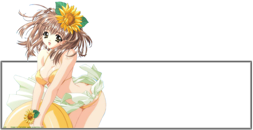
As for my sig, here's my only newest one that I have made. 
__________________
|
|
|
|
|
|
2006-12-12, 18:24
|
Link #47 |
|
sleepyhead
AuthorJoin Date: Dec 2005
Location: event horizon
|
@ Zaris
Uhh.. wrong thread.. there are big stiky threads above just for this.. No need to post such things here.. will only lead to unnecessary confusion.. BTW using an Adjustment Layer via the little button next to Layer Mask is much better then using Image > Adjustment > Levels.. since you can one, go back should you want it.. two, tweak it anytime you feel like it.. and three, it's a non-destructive method.. just like Layer Masks
__________________
|
|
|
|
|
2006-12-12, 22:00
|
Link #48 |
|
Kira_Naruto, the ecchi
Graphic DesignerJoin Date: Dec 2005
Location: http://www.exciting-tits.com/
|
@ Zaris.. I hope you wont mind.. but I've reported your post so it could be moved to the tutorial thread here .. it will benefit most there, since it'll get index for fast reference, over in here.. it could lost in the passage of time
@ shinobiknight0 .. Impressive work, really, there isnt much that could be frown upon ... except that the text is hard to read @ deathkillz.. if you visiting .. explain bad quality you talking about in the rating thread  ... ... btw, this is NOT recycled sig. Its a total makeover .. @ BC.. Alas, its my favourite Caster pic 
__________________
|
|
|
|
|
2006-12-12, 22:49
|
Link #49 | |
|
I am mowing clowns
Join Date: Dec 2005
|
Quote:
|
|
|
|
|
|
2006-12-12, 22:57
|
Link #50 |
|
of Porsche
Join Date: Jul 2006
Location: Pasadena, California
Age: 39
   |
Oops.
I took for granted that this was also a thread to share and discuss our creation process. I'm sorry. >.< Is post report a bad thing? =[ --------------------------------------------------------- @shinobiknight0 Who is that guy lighting his cigarette? Looks like Vin Desiel since I can't see his hair. = O Overall, it is a good sig emphasising the light at the center of the canvas while everything else remains dark. The font is hard to read not in the sense that I can't make out the letters, but that I don't see the first three "nin" (I believe). It blends a bit too well with the background. Furthermore, the design at the bottom left canvas is difficult to make out. Is that on purpose? And to the right, there is an odd charchol/smudge effect that distorts the shoulders and everything else. I personally would have chosen a less grainy effect, but to each his own, eh? @BlackCatXIII I have very little to complain about with this. Everything just...works. It blends into the white well. The image isn't of low quality, the font is readable. But if I really had to complain about something, it's just that the image is TOO white. There's white on her yellow shirt, white on her face, and not to mention a white background. But if that's the original image you worked with, it can't really be helped. @Kira_Naruto Again, thanks for directing me to this thread, albeit I'm not really certain what to do here now after my blunder.  Now then, to your sig. I see the teardrop was added and moved with every frame. I don't want to sound too much of a perfectionist, but with her head hanging down the way it is, I don't think the tears in her eye would run down her face but rather, would drop straight down. Of course, it can happen. It's been a while since I've observed somebody crying. And since a falling tear would be too hard to catch, it's pretty good already. = P Now then, to your sig. I see the teardrop was added and moved with every frame. I don't want to sound too much of a perfectionist, but with her head hanging down the way it is, I don't think the tears in her eye would run down her face but rather, would drop straight down. Of course, it can happen. It's been a while since I've observed somebody crying. And since a falling tear would be too hard to catch, it's pretty good already. = PLots of blue. My favorite color is blue, and you certainly added many tones. I like how everything behind her is fuzzy/blurry. But if you want to, here's what I'd suggest: thin the outer black line going over your foreground character's hair. It will make her look less...bold, if you know what I mean. Of course you don't. lol I'm about creating a balance from left to right of the canvas. The left is softly colored, but the right is so up there on the contrast. Making her slightly less standing out might (miiiiggghhht) improve it. ------------------------------------------------ I hope I posted somewhat relevant things here. = \ |
|
|
|
|
2006-12-12, 23:11
|
Link #51 |
|
Kira_Naruto, the ecchi
Graphic DesignerJoin Date: Dec 2005
Location: http://www.exciting-tits.com/
|
No no.. your post is very relevant to the thread's interest.. If you know what I mean
.. I really need to curb my 4chan addictness >.<, In all honestly, please do post your thoughts on signatures put in here.. Each have it owns eyes and sees differently.. even if we looking at the same thing. If you read tru the thread, its plain to see that me, Klashi, and BC in particular have very different view on how we see the other sig.. This is very good IMO, gives us better perspective as a whole. I see from your comments above that you have a different perspective as well. I'll see if I could reduced the contrast a bit more... About the tears.. If some1 crying, and looking down like that, the tears do trickled down the cheek, unless she bawled It would be better if I slowed the tears more, but then, I'm restricted to the filesize requirement, thus the speed is a compromised >.<About the report.. no, not a bad thing.. but it keeps the thread of getting cluttered... its like a direct pm to the mod in charge (If I just post a direct request in the thread to have it moved... the mod might not be able to see it... unless they frequent this thread as well) .. Dont be discouraged EDIT A little tweak =3 
__________________
Last edited by KiNA; 2006-12-13 at 00:28. |
|
|
|
|
2006-12-13, 01:23
|
Link #53 |
|
Kira_Naruto, the ecchi
Graphic DesignerJoin Date: Dec 2005
Location: http://www.exciting-tits.com/
|
 Ok then .. On first look .. there's nothing wrong with it, its an ok sig .. but definitely could be improves on :- Its too bright IMO, the BG... while its nothing wrong, it gets to you after a while :- its a little bit heavy on the right. A simple solution is to shift some weight to the left by staggering the text.. What I mean is, move the text a bit to the left and instead of having S (in Saotome) right under G(in Genma), move the 2nd name so the S is under N/M.. moves it to bottom left just a bit ... Then, if able, moves the BG panda a bit more to the center .. This is just a compositional advice, things that naturally came with practice, heck, I sometime have problem with sig composition as well I'm a bit curious .. is the BG bamboo a pic? or is it brushing? If its a brush, care to tell me where you get it?
__________________
|
|
|
|
|
2006-12-13, 01:41
|
Link #55 |
|
Kira_Naruto, the ecchi
Graphic DesignerJoin Date: Dec 2005
Location: http://www.exciting-tits.com/
|
Could prolly benefits you a lot
Thanks tho for the answer, I kinda like the bamboo effect, thats why I asked if it was done with brush.
__________________
|
|
|
|
|
2006-12-13, 12:02
|
Link #56 | |
|
Ha ha ha ha ha...
Graphic DesignerJoin Date: Apr 2006
Location: Right behind you.
Age: 35
|
Quote:
Either way, I really like the animation of the tear, Kira_Naruto. I'm impressed that you did that so well.
__________________
|
|
|
|
|
|
2006-12-13, 12:55
|
Link #57 | |
|
~ You're dead ^__^* ~
Graphic DesignerJoin Date: Apr 2006
Location: uk, England
Age: 34
|
Quote:
well its just that when i look at the sig there are too many diffusion dots everywhere ~ 64 bit colours? but you can help it tho being such a sig trying to keep it within AS safe size ~ heck even my attempt animated one got me scratching my hair out trying to keep it AS safe but also keeping the quality...but i failed total makeover huh? wheres you old one? and while im here i might as well put mine up for butchering erm i mean constructive criticisms ^_^ 
__________________
|
|
|
|
|
|
2006-12-13, 14:59
|
Link #59 |
|
~ You're dead ^__^* ~
Graphic DesignerJoin Date: Apr 2006
Location: uk, England
Age: 34
|
dont tell me you havent seen code geass
nono both the pics are of the same person but the right pic is a more "fluffy" than the right one (which is her true personality mind you ^_^) the chibi? well thats the main character (and was in the original pic) ~ i guess hes there to make a statement actually looking at the pic again i think that its been parodied from ~ Mamoru-kun ni Megami no Shukufuku wo! *yoink*  
__________________
|
|
|
|
 |
| Tags |
| discussion, signature |
|
|