2011-01-31, 17:25
|
Link #3842 | ||
|
Senior Member
Join Date: Aug 2008
Location: Your Mind
Age: 32
 |
Quote:
 Quote:
|
||

|

|
|
2011-02-02, 13:12
|
Link #3847 | ||
|
Anime Cynic
Join Date: Jul 2010
Location: USA
Age: 35
|
Quote:
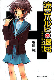
Or, perhaps it's that the KyoAni designs are the ones I associate with the anime. Because I've seen those characters animated, it's easier to believe that the images with those designs are more "real"; that is, that they're simply still frames in an active world rather than actual drawings. On the other hand, the novel artwork really does "feel like" sketches or drawings, rather than actual characters. I dunno. Maybe the KyoAni ones are simply more expressive? Maybe it's the huge eyes on the novel-style characters that turns me off, and the anime designs simply look more realistic and less stylized? Or, maybe it's that I'm just used to the original anime art. After all, I really don't like the Season 2 designs, so maybe that factors into it. But I doubt that's the whole story either, since I also like the Season 1 art a lot better than the art in many other animes, and I'm not necessarily a fan of the "realistic" designs of some animes. Spoiler for comparison:
Can someone who knows about this sort of thing explain the technical differences between the two styles? I'm stumped.
__________________
Last edited by Gamer_2k4; 2011-02-02 at 13:22. |
||
|
|
|
|
2011-02-02, 21:29
|
Link #3849 |
|
Aurum
Join Date: Apr 2010
Age: 30
|
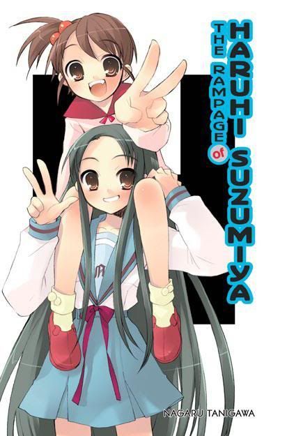
I have been waiting for vol 5 to come out in english.
I always liked the snow mountain syndrome arc. I am still deciding whether to get the paperback version though since I have collected the hardcover novels so far. I may end up getting both this time around.
__________________
|
|
|
|
|
2011-02-02, 23:23
|
Link #3850 | |
|
Onee-Chan Power~!
Join Date: Dec 2010
Location: In this reality (A.K.A. Colorado, U.S.A.)
|
Quote:
__________________
|
|
|
|
|
|
2011-02-03, 11:34
|
Link #3851 | ||
|
Senior Member
Join Date: Dec 2008
Location: Singapore
|
Quote:
Anyway those designs are not uniqe to Haruhi, quite a few novel illustrations have that similar cartoonish, light-hearted feel, Toradora comes to mind. Spoiler for Did some one say cross arms?:
Quote:
Oh but if you're talking about the bottom right picture, that's Asakura actually. |
||
|
|
|
|
2011-02-03, 23:50
|
Link #3852 |
|
Onee-Chan Power~!
Join Date: Dec 2010
Location: In this reality (A.K.A. Colorado, U.S.A.)
|
No, not Asakura. I meant the second picture, on my touch screen it's the second from the top.
Also, why is it that newer styles are less "cartoony"? Especially in animus like Kanon to Kanon 2006, and Kyoto Animations older stuff verses newer. I guess its just evolution of style, but I could be wrong.
__________________
|
|
|
|
|
2011-02-04, 02:36
|
Link #3853 |
|
High Saint of Asakuraism
 Author AuthorJoin Date: Mar 2010
Location: The Great White North
|
The outfit Haruhi's wearing in the second picture is the summer outfit for Kouyouen, so it's never actually seen in the anime, nor anywhere else really. I suppose that it might show up in Nagato Yuki-chan no Shoushitsu eventually, but we're still in winter outfits in that one.
__________________
|
|
|
|
|
2011-02-04, 07:56
|
Link #3854 |
|
Nyahahahaha♥
Join Date: Aug 2009
   |
Kadokawa updated their special site for the Haruhi series today. A 1 day extension of the trailer going around Akiba, mention of an ad last Saturday in the Yomuri newspaper, a digital poster placed in the Akiba Japan Rail station, and reference to the Sneaker February releases video on Kadokawa's Youtube channel were updated in the news portion of the site. The Surprise special site is still under development.
Next week they will reveal part of the 64 page color booklet to be included with the first press edition of Surprise.
__________________
|
|
|
|
|
2011-02-04, 10:44
|
Link #3855 | |
|
Anime Cynic
Join Date: Jul 2010
Location: USA
Age: 35
|
Quote:
As for this particular anime, I'd argue that Ito's drawings are less cartoony because she's getting better. And as for the show itself, well, the second season stuff is (IMO) much more cartoony than the first season, so you'll have to give more examples before you can consider your point made.
__________________
|
|
|
|
|
|
2011-02-04, 14:12
|
Link #3856 | |
|
Sav'aaq!
Join Date: Jan 2007
Location: Hyrule
Age: 51
|
Quote:
Of course, that's what it all comes down to, is personal stylistic preference. If you're not yet burnt out on the generic K-on style of moe, chances are you prefer the anime version, since they're fairly inextricably linked. Haruhi S1 is a blend of the Ito illustrations and generic Key designs, K-on anime is a blend of the K-on manga and Haruhi S1 designs, and Haruhi S2 (and to a lesser degree Disappearance) vaccilate between S1 designs and the unholy S1/K-on anime hybrid most apparent during E8.
__________________
|
|
|
|
|
|
2011-02-04, 14:16
|
Link #3857 |
|
Sensei, aishite imasu
Join Date: Mar 2008
Location: Hong Kong Shatterdome
|
The image looks without motion cause it's just one individual frame. The motion comes from lots of other frames.
Noizi's illustration is designed to convey motion in one frame. That's why it looks better in just one glance over. |
|
|
|
|
2011-02-04, 14:22
|
Link #3858 |
|
Unspecified
ScanlatorJoin Date: May 2010
Location: Unspecified
|
to me in depend on character.
Ito haruhi > anime haruhi !to mikuru < anime mikuru Ito yuki = anime yuki Ito haruhi more cute while in anime haruhi have bitch-ish fell !to mikuru is too cute and idiot to the point it feel uncanny. anime mikuru tone this a little both Ito yuki and anime yuki gives nice feeling of emotionless. (prefer ito alternate!yuki compare to anime one because the anime version is simply yuki with mikuru dash)
__________________
|
|
|
|
|
2011-02-04, 15:17
|
Link #3860 | |
|
Unspecified
ScanlatorJoin Date: May 2010
Location: Unspecified
|
Quote:
Spoiler for spoiler pic:
damn its hard to find non alternate yuki on surprised so decide to put big picture instead
__________________
|
|
|
|
|
 |
| Tags |
| shounen, sneaker bunko, seinen, light novels, manga |
|
|