2010-04-06, 18:33
|
Link #41 |
|
Paparazzi
Join Date: Mar 2008
Age: 41
|
Thanks for the comments guys.
@ganbaru Tweaked the cloud layer a bit. Moved it up a little thus getting rid of the black spot on it and was able to up the quality a bit as a bonus. As for the train, I was more going for a window timelapse idea but the train works just as well  @LKK I'm reluctant to make the animation slower. It's already hovering around being really jerky, tried it a little slower and it became a slideshow.    
|

|
|
2010-04-06, 18:35
|
Link #42 | |
|
~Rock ☆~
 Graphic Designer Graphic DesignerJoin Date: Apr 2007
Location: In The Farplane
|
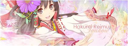
Another try with Patchouli... text as soon as i figure something out
 Quote:

__________________
|
|
|
|
|
2010-04-06, 18:47
|
Link #43 |
|
books-eater youkai
Join Date: Dec 2007
Location: Betweem wisdom and insanity
|
@ OceanBlue as Evil Rick said, it would need a border.
@ Periwinkle the second sig look better, and I suggest you to use JPEG insted of PNG 24 @ Haladflire65 and Cyz your latest choice of font really better. @ escimo it look betteer now without the dark cloud
__________________
|
|
|
|
2010-04-06, 20:03
|
Link #44 | |||
|
Black Dragon
Graphic DesignerJoin Date: Dec 2007
Location: In the Netherrealm, thinking who to betray next...
|
Quote:
 Quote:
 Quote:
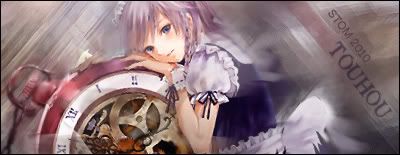
Hmmm... the animation looks a bit forced, it doesn't seem to have enough frames to have a realistic enough, we could help this out bu slicing the sig. 
__________________
|
|||
|
|
|
2010-04-06, 21:53
|
Link #45 | |
|
Saber's Husband XD
Join Date: Oct 2006
Age: 36
 |
Quote:
maybe you're not endrance j/k kinda weird since I always knew your entry will always be animated EDIT: just saw you're patchy sig.... ^^ don't know if she''ll puke in a moment... IMO it's better if she's smiling
__________________
|
|
|
|
|
2010-04-06, 23:03
|
Link #47 | |
|
is not amused
Graphic DesignerJoin Date: Jul 2007
Location: Naval Base
|
I'm having a headache on which character to use, since I have lots of favorites.
On the other hand, what to do is the real challenge. Quote:
Spoiler for about her:
I like the pop-out aspect and the background looks okay. Only thing is, I don't like the font that much.
__________________
|
|
|
|
|
2010-04-07, 08:28
|
Link #50 | |
|
Senior Member
Join Date: Nov 2006
Location: Virginia, USA
Age: 62
|
Quote:
__________________
|
|
|
|
|
2010-04-07, 10:46
|
Link #51 | |
|
Not an expert on things
Join Date: Jun 2007
|
Quote:
As for the border idea for mine, I played around with it for a bit [Tried the border all around and the only-horizontal border], but it doesn't seem to work with the effect I'm going for [which is a more open-flow, expansive feeling]. Thanks for the advice though. |
|
|
|
|
2010-04-07, 12:13
|
Link #52 | |||
|
Panzer Vor!
Join Date: Sep 2007
Location: Inside a WWII German tank
|
Quote:
I can say that it feels that it no longer needs any more touching up.Quote:
Quote:
|
|||
|
|
|
2010-04-07, 13:57
|
Link #53 | |
|
Senior Member
ArtistJoin Date: Mar 2009
Location: Normandy SR-2
Age: 29
|
Quote:
__________________
|
|
|
|
|
2010-04-07, 14:03
|
Link #54 |
|
Anxious bookseller
AuthorJoin Date: Aug 2006
Location: Shibuya Psychic Research
|
Uguuu~~
Vers 1...maybe  According to MiniT she is Youmu Konpaku. Personally I just liked the outfit she's wearing. I need some help, I have to save it as a gif for the transparency to work but Im losing tons of qual when I save it. I tried anything I could think of in IR improve the qual but nothing is working, even slicing it didnt help actually made it worse. When its in .png form size is 88kbs, in gif its only 27kbs and you can soooooo tell. Tips on how to improve this? C&C?
__________________
|
|
|
|
2010-04-07, 14:19
|
Link #55 |
|
Senior Member
Join Date: Nov 2006
Location: Virginia, USA
Age: 62
|
@ Manju: Did you try to horizontally slice the top from the border upwards & save as a png (or maybe a gif, maybe not) with the rest from the border downwards saved as a jpg with some compression? And maybe resize the whole sig slightly smaller?
__________________
|
|
|
|
2010-04-07, 14:34
|
Link #56 | ||
|
♪ ~ ♫
ArtistJoin Date: May 2008
Location: Europe
Age: 35
  |
Quote:
Quote:
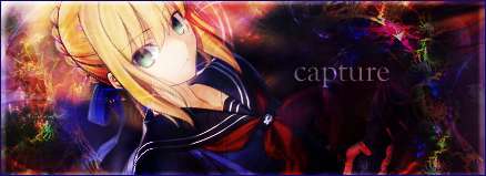
Touhou - Icey, you're a genius. Thanks for a chance to compete with a sig I've always felt very proud of. Final Entry - Konpaku Youmu 
__________________
|
||
|
|
|
2010-04-07, 16:46
|
Link #59 | |
|
~La-la Land~
Graphic DesignerJoin Date: Jul 2007
Location: Seattle
Age: 37
|
Quote:
While the faded colors are very nice and render/text placement perfect, I have no feeling of depth. The sig is overall flat and devoid of any lighting direction.
__________________
|
|
|
|
|
2010-04-07, 16:53
|
Link #60 |
|
books-eater youkai
Join Date: Dec 2007
Location: Betweem wisdom and insanity
|
@ White Manju Bun as others suggested, you could slice your signature, the transparent slice in PNG ant the full slice in JPEG. And if the PNG slice is too big, you can slice it in 3 slice, using gif for the empty area ant PNG for the head slice.
EDIT: my 4th try, I reworked the text and the render. C&C would be welcome. 
__________________
Last edited by ganbaru; 2010-04-08 at 02:19. |
|
|
 |
| Tags |
| contest, signature of the month, sotm |
|
|


 :|::|
:|::|