2011-07-04, 20:16
|
Link #18801 |
|
Covered in Darkness
 Graphic Designer Graphic DesignerJoin Date: Jul 2010
Location: Missing~
 |
@ganbaru
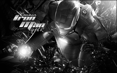
#1 The bg seems to conflict with the render, and for some reason the colors really put me off ^^" 7.8/10 #2 This one's a lot better, and I love the colors plus it seems well blended ^-^ 8.8/10 @Ren Ummm...I really can't seem to get what's the focus -_-" 8/10 @Kuroi Awesome blending, and great colors mash-up! Loved it :3 Just the focus seems a bit chaotic 9.2/10 @matty Nice one 8/10
__________________
|

|

|
|
2011-07-04, 22:22
|
Link #18802 |
|
Senior Member
ArtistJoin Date: Mar 2009
Location: Normandy SR-2
Age: 29
|
ganbaru: I like the second better as well
 8.8/10 for it, 8.6/10 for the first. 8.8/10 for it, 8.6/10 for the first.Star! Welcome back! 8.8/10, nice blending and interesting texture but I'd probably rework the text.
__________________
|
|
|
|
|
2011-07-05, 15:58
|
Link #18811 |
|
Senior Member
Join Date: Aug 2010
Location: Boston
Age: 34
|
ganbaru: I think the difference is that in the one you're using, the text had to be readable, and since you didn't use stroke that limited what you could do with contrast/lighting in the background. I definitely like the lighting style in the posted two though. I like the second one best. 8.8 for that one.
Star-Wing: Nice texture, and I like the light-circle effect. 8.9
__________________
|
|
|
|
|
2011-07-06, 04:01
|
Link #18816 |
|
Covered in Darkness
Graphic DesignerJoin Date: Jul 2010
Location: Missing~
|
@Kagayaki
I really like the feel of your signature and the lightning is done beautifully. Also, the colors look great...just the text seems a bit weird to me, plus the right side of signature is way too empty 8.8/10 @Ren I personally like colored sigs, but this one is awesome  R&R in your thread...8.9/10 R&R in your thread...8.9/10@ganbaru What's the yellow thing? Head-wear or something o_O Bleniding seems a bit weird to me, 8/10 @matty543 Another beautiful work by Patchy ^.^ 9/10 @Ludrio Hmm...looks a bit strange...7.5/10
__________________
|
|
|
|
|
2011-07-06, 12:30
|
Link #18820 |
|
Quietly Lurking
Graphic DesignerJoin Date: Mar 2010
Location: Beneath the prodigious sky...
|
matty543-8.6/10 Agreeing with Halad. Sorry but, having such a huge focal as a sig does not work. If the intention was for it to be something else (I.e. Wallpaper or just a graphic to look at, etc.), then it's pretty good.
__________________
|
|
|
|
 |
| Tags |
| rate, signature |
|
|


 )
)