2008-06-23, 06:21
|
Link #42 |
|
✘˵╹◡╹˶✘
Join Date: Nov 2006
Location: Australia
|
15. Vibeke
 17. bigdave 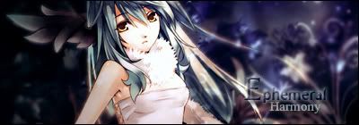 39. Ice Climbers  PS: I recommend that next time, each signatures should be in separate spoiler tag. Because some of them are really good by itself, but become dull when stand next to a more vivid signature(there are opposite cases also). So it's not fair for signatures about dark theme or less colourful. The size also bring disadvantage to smaller signatures when they stand next to a bigger one, even when they should look better with the same size Edit1: to answer Kina, it's will be pointless to vote if you can't judge thoughtfully and accurately through:P Edit2: Just recognise, there is no Haruhi. Noooo!!! >_<
__________________
Last edited by risingstar3110; 2008-06-23 at 06:48. |

|
|
2008-06-23, 07:31
|
Link #45 |
|
Kira_Naruto, the ecchi
 Graphic Designer Graphic DesignerJoin Date: Dec 2005
Location: http://www.exciting-tits.com/
|
@ risingstar.. its not a competition if we dont put it against each other
 And Haruhi stock would be rejected as she dont have a noticeable nonhuman trait ^^
__________________
|
|
|
|
2008-06-23, 08:14
|
Link #47 | |
|
is not amused
Graphic DesignerJoin Date: Jul 2007
Location: Naval Base
|
Quote:
Yes, Haruhi isn't human but Does she look nonhuman? She doens't portray any non-human traits at all.
__________________
|
|
|
|
|
2008-06-23, 09:20
|
Link #48 | ||
|
✘˵╹◡╹˶✘
Join Date: Nov 2006
Location: Australia
|
Quote:
 Anyway , let not go so far from it (don't want it to be off topic too much) Quote:
PS: is there a topic that contain all of winning signatures for each month?
__________________
Last edited by risingstar3110; 2008-06-23 at 09:46. |
||
|
|
|
2008-06-23, 10:27
|
Link #52 |
|
Imouto-Chan♥
Graphic DesignerJoin Date: Mar 2007
Location: England
Age: 30
|
Here are my votes
15-Vibeke, I love chobits and the animation is great, its an amazing effort. 36-Oceanblue, I like the use of brushes in this sig, makes the background look full. 6- IchigoSora, Hanyuu! a great effort! OMG I have 5 votes already, and a nice mention! I love all the signatures but if i could choose more than 3 i would have chose a few more!
__________________
|
|
|
|
2008-06-23, 11:25
|
Link #54 |
|
Not an expert on things
Join Date: Jun 2007
|
I can't stand voting for myself. Might as well see how I do from other people's votes.
5. Bearshare 33. Meirin 39. Ice Climbers Edit: The problem with risingstar's suggestion is that if a dull signature is created, obviously it would look dull next to a vivid signature. If a dull signature is used, then it should have other ways of drawing the focus to the signature, such as contrast or emphasis or something. If it does, then it'll stand out on its own even if the signature next to it is brighter or darker. If it doesn't, then the composition of the signature next to it is better, since it brings attention to itself and keeps it there [Of course, there will be those signatures that draw attention, but don't have a good balance or are too strong in categories. Viewers will just skip those anyways.]. I would give an example from the contestants, but I don't feel like that would be a good idea, since votes are still being cast. |
|
|
 |
| Tags |
| contest, signature, sotm |
|
|