 2007-06-04, 16:41
|
Link #3321 |
|
~ You're dead ^__^* ~
 Graphic Designer Graphic DesignerJoin Date: Apr 2006
Location: uk, England
Age: 34
 |
cyz! ~ i love CC! but i think you could improver her look but playing around with the colour balance...atm her skin colour looks a bit "off" >_< 8.5/10
raiju32 ~ really nice! san chan!  maybe you should try some blending though and some contrast adjustment to maker her look even more stunning :3 9/10 maybe you should try some blending though and some contrast adjustment to maker her look even more stunning :3 9/10darkjester ~ playful like :3 cant really crit it  8/10 8/10ayame ~ oo i like the glass like effect in the BG...but its true that the font doesnt really suit >_< 8/10
__________________
|

|

|
|
2007-06-04, 17:56
|
Link #3322 |
|
Saber's Husband XD
Join Date: Oct 2006
Age: 36
 |
Another new one...
Oh well It's getting hot this time... ratings.... Icy cold Suigintou (DKZ) ~ 10/10 A sexy CC (Cyz) ~ 9/10 Cool Kakashi (Spec_Ins) ~ 10/10 Didn't know this one...but kawaii (Raiju32) ~ 10/10 a + for having motsu in it (D.Jester) ~ 9/10
__________________
|
|
|
|
|
2007-06-04, 22:40
|
Link #3323 |
|
Ha ha ha ha ha...
Graphic DesignerJoin Date: Apr 2006
Location: Right behind you.
Age: 35
|
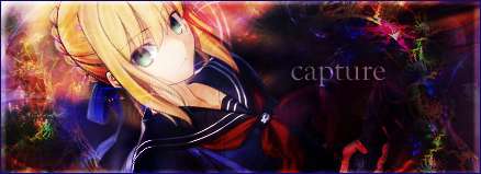
Capture: Very nice sig indeed. Cool design with the angled "photos"---it really adds a lot to its overall effect. And it really makes me feel like summer. Extra points for having seasonal cheer!
+11/10!!
__________________
|
|
|
|
|
2007-06-05, 07:37
|
Link #3324 |
|
Senior Member
Join Date: Jul 2006
Location: Australia
Age: 36
|
Raiju32 - San-chan
 I like how the colors and stuff match but yeah, a little contrasting would help abit. I like how the colors and stuff match but yeah, a little contrasting would help abit.Cyz - Getting better by the day eh  Capture - It's got a summer feel to it, I like. (Bias - Rin should be infront )Me - Same same same...
__________________
|
|
|
|
|
2007-06-05, 12:12
|
Link #3325 |
|
(ノಠ益ಠ)ノ彡┻━┻
 Moderator ModeratorJoin Date: Mar 2006
|
@cyz - nice CC, she seems a little green though. 9/10
@darkjester - another cute zazie sig. 9/10 @raiju32 - Clean, I like it. 9/10 @capture - nice picture effect! 9/10 @saphyre - the handwriting animation is a nice touch. 9/10 @redframe - the animated signature I had was from Claymore. My current one is a static from the same show. @me - static sig, just trying out some new effects. Making the Claymore logo from scratch was a total pain, but I like how it turned out.
__________________
|
|
|
|
|
2007-06-05, 12:24
|
Link #3326 |
|
"Show it to me"
Join Date: Dec 2005
Location: In solitude, where we are least alone
|
@ Deathkillz: I played around it. Actually, that C.C is made up of 3 layers. One is the normal one, one with luminosity in it, and another......I think overlay or color burn or something? Anyway, it turn out like that
 @ capture: love it. More Saber so it's good 9/10@ ankoku: too green. It's a little difficult to see the img at first glance. You should also do some changing with the texts too 7/10
__________________
|
|
|
|
|
2007-06-05, 23:54
|
Link #3327 |
|
Fuwaaa~~~
IT SupportJoin Date: Apr 2007
Location: Indonesia
Age: 34
|
@ Cyz : Nice color balance for the tattoo 8.5/10
@ ankoku : The text is rather hard to read... 7/10 @ saphyre : Nice animation for your name! Love it! 9/10 @ capture : Pretty nice design! but the small images rather blurry (or it's just my eyes?) 8.5/10
__________________
|
|
|
|
|
2007-06-06, 10:47
|
Link #3330 |
|
Inactive Member
Join Date: Dec 2005
|
Rating ^^'
I'd give everyone a 10/10 since I'm not skilled at graphics at all But since a moderator killed my previous sig which was given to me, I had to change it... I used my very basic knowledge to clean, resize & make it transparent... and it had 2 layers. See below 
|
|
|
|
|
2007-06-07, 11:01
|
Link #3332 |
|
Kira_Naruto, the ecchi
Graphic DesignerJoin Date: Dec 2005
Location: http://www.exciting-tits.com/
|
Cyz.. you know better not to tempt people answering question in here
 .. They ends up answering question and forgot to rate.. as a result, post get deleted -_-.. .. They ends up answering question and forgot to rate.. as a result, post get deleted -_-.. @ Syaoran.. for someone who know very basic skills, your work is pretty clean.. ^^ Cute Sasuke and Naruto ^^ @ Cyz .. Crop is excellent.. but she kinda bit overburned IMO Quality kinda low@ Diaboso .. Nice!!! would be better if the white is replaced by transparent.. but excellent indeed^^ .. ah.. WZ work I see ^^ @ ankoku.. kinda bit messy =/ @ Furuno .. I prolly on your ignore list.. so you prolly dont read this anyway>.> @ Saphrye.. Nice.. synchronized blinking with Tsukasa ^^b @ S_I.. weird BG si weird =/ @ Capture.. Very clean ^^b @ Dk .. its a crop + its animated .. O_O.. Cyz + rika = dk ? O__O @ Raiju ^^b.. name could be more visible tho  @ jester .. weird star placement.. dont look too natural IMO @ Ayame .. Font for sousei kinda hard to read.. but excellent work nonetheless @ Honey .. .. I kinda like the new style you've been using lately.. KUTGW! @ KiNA .. forgive the noob attempt to warm up again >_<
__________________
|
|
|
|
|
2007-06-07, 11:47
|
Link #3333 | |
|
"Show it to me"
Join Date: Dec 2005
Location: In solitude, where we are least alone
|
Quote:
@ KiNa: Another Yoko sig eh? Though this one isn't good as your last few ones, it's still okay. 8/10
__________________
|
|
|
|
|
|
2007-06-07, 11:54
|
Link #3334 | |
|
Ha ha ha ha ha...
Graphic DesignerJoin Date: Apr 2006
Location: Right behind you.
Age: 35
|
Quote:
I also give it an 8/10.
__________________
|
|
|
|
|
|
2007-06-07, 14:28
|
Link #3335 |
|
♪~ Daydreaming ~♪
Graphic Designer Administrator AdministratorJoin Date: Dec 2005
Location: Italy
|
Cyz: Great crop work. I also like the fonts you always come up with. 8/10
Spectacular_Insanity: The background looks really cool, I don't like the font much, it's not easy to read. 7,5/10 KiNA: For your skills it looks like a poor work indeed. The two main sources are plain and pasted there seemingly without much connection. Name and animation are very good though. 7/10 Syaoran: Nice use of transparency. Peaceful and soothing 8/10 Diaboso: That's an excellent work with not much to add. 9/10
__________________
|
|
|
|
|
2007-06-07, 15:21
|
Link #3336 |
|
Desu Desu Desu!!!
Graphic DesignerJoin Date: Mar 2007
Location: Texas
Age: 41
 |
furuno: simple... yet it speaks to me...
8/10ankoku: elegant... still kinda hard to see though... 7/10 Syaoran: i like it... its unique and looks cool while simple... 7.4/10 KiNA: very nice... though it could use a border or a thicker one or something.... still pretty damn good... 9/10 Pellissier: hehe... she doesn't look too happy... 7.6/10 k thxs previous sig... Spoiler for sig rated:
Last edited by darkjester; 2007-06-10 at 00:04. |
|
|
|
|
2007-06-08, 07:28
|
Link #3337 |
|
A talking white tiger :O
Graphic DesignerJoin Date: Dec 2005
Location: Malaysia
|
Kina~ lol.. is your exam finish already
, okay that's so unlike you sig kina ,need to warm up more 7/10 ~ for being gif~Spectacular_Insanity~ IMO ,the bg doesn't match with kakashi, though i like the font 7/10 Pellisier~simple and nice, Pell sure like making simple gif sig. I like the color quality .. clean.. or something like that.. 10/10 for being gif~ darkjester~ now its look much more better than the the green one ~7/10~
__________________
|
|
|
|
|
2007-06-08, 09:42
|
Link #3338 |
|
Thinking outside the box
Graphic DesignerJoin Date: May 2007
Location: The Netherlands
Age: 37
|
Redframe Love it. 9.5/10 really cute. And it's even animated. Not that it adds much to it. But looks awesome. Nice and creative sig.
darkjester Looks neat. The rainbow color in the name seems a bit odd while the whole sig has a purple look to it. But it adds something special to it to i guess. 7.5/10. Pellissier Looks nice. And nice font. but meh i'm not big fan of such typ of sigs. And i sort of lost intrest in Lucky Star to. 7/10 Cyz Text blends in nicely. Looks good overal. But her position just makes it a bit awkward to look at. 7.5/10 Kira_naruto Not a fan of yoko. And meh.. i see to much yoko already these days. 7.5/10 because it's animated Syaoran I don't know what the text says. So i don't know if it adds much to it or not. But it looks clean. 7/10 Diaboso Looks good 7.5/10 Like the render. But the rest of the white bg seems a bit plain ankoku Looks bit odd with the color. 6/10 furuno Looks really clean, a bit to clean 7/10 saphyre cute, but meh Lucky Star gifs just can't seem to impress me these days. 7/10 capture Like the unusual shape of the sig. And good quality for a gif. 8/10 for the unique shape.
__________________
|
|
|
|
|
2007-06-08, 12:43
|
Link #3340 |
|
Senior Member
Join Date: Jul 2006
Location: Australia
Age: 36
|
Redframe - Very cute, and it has a little animation along with it, nice
Sephi - I like the border and such, but I can barely see your name there on the top left. Me - A little more to the ecchier side 
__________________
|
|
|
|
 |
| Tags |
| rate, signature |
|
|


 and the newer one is on display below. Still a bit "washed out" I suppose, but the source wasn't the best honestly. Good Claymore pics sources aren't easy to find.
  Expect a new sig soon.


