2007-10-16, 16:57
|
Link #4321 |
|
~ You're dead ^__^* ~
 Graphic Designer Graphic DesignerJoin Date: Apr 2006
Location: uk, England
Age: 34
 |
Thrasher187 ~ the siggy is too big and so it looks empty - but cool effects and zomg fate chan! 10/10 (bias
 ) )Marina ~ really cute scene ^^ again it looks a bit empty due to the size. 8/10 Ai Suzuki ~ nice try but youve abused the lighting too much - put some dark areas in the siggy to display more "depth" 8/10 konstargirl ~ its mew!! ^^ 7/10
__________________
|

|

|
|
2007-10-16, 17:11
|
Link #4322 |
|
"Show it to me"
Join Date: Dec 2005
Location: In solitude, where we are least alone
|
@ Ai Suzuki: very cool! Haven't seen much F/SN stuff lately. 8/10
@ Deathkillz: A nice change after having all those dark colored ones. Plus, it's Fate so I can't complain 9/10
__________________
|
|
|
|
|
2007-10-16, 17:45
|
Link #4324 |
|
Senior Member
Join Date: May 2007
Location: Las Vegas, Nevada.
Age: 39
|
konstargirl: 7/10.
Caldron: 8/10. Thrasher187: 7/10. Marina: 9/10. Nice color quality. Cyz: 8/10. Spectacular_Insanity: 7/10. InternalBrain: Current: 9/10. Other: 8/10. Love them. Ai Suzuki: Current: 8/10. Nice graphics. Other: 6/10. Deathkillz: 8/10. |
|
|
|
|
2007-10-16, 18:15
|
Link #4325 |
|
we girls arnt safe!
ArtistJoin Date: Apr 2006
Location: In the space between your walls
Age: 36
|
Ai Suzuki 8.7/10 yeah Rider
konstargirl 7.9/10 "meeeew" Marina 8.5/10 finger eating kiddy of doooooooom! Thrasher187 - 8.2/10 mellow yellow Crystal Requiem 9/10 nice but I dont like the text InternalBrain 7/10 meeeeh |
|
|
|
|
2007-10-16, 18:45
|
Link #4326 |
|
Member
FansubberJoin Date: Oct 2007
|
InternalBrain - Nice signature, very cute! 8/10
Ai Suzuki - I like it but there's not enough in the background... 7/10 Deathkillz - I love yours, very light! 9/10 Crystal Requiem - I like it, but the font color/style could be better  9/10 9/10
|
|
|
|
|
2007-10-16, 22:56
|
Link #4330 |
|
Junior Member
Join Date: Oct 2007
|
Internalbrain very hot 8/10
Ai - very nice 8/10 Thrasher - 7/10 well here mine this i think is ok..need more work though..i could do something more...   too bright..and i think something missing..what is it? too bright..and i think something missing..what is it? this is my first attempt to make the 1st on the top but i keep both to expierement.. this is my first attempt to make the 1st on the top but i keep both to expierement..
|
|
|
|
|
2007-10-16, 23:30
|
Link #4331 |
|
Retired
Graphic DesignerJoin Date: Mar 2007
Location: Princeton University
|
Okay Bloodstrike, let me run down the list
 1st one- render is too blended into the bg so its really hard to see, nice design tho 7/10 2nd one- nice one, bg fits the render well 8.5/10 3rd one-hmm, same attempt huh, i actually think this one is better lol, but maybe get the colors back since the black/white doesnt really fit the bg color 7.5/10 Okay, I had a sig battle with kohakuslayer, but since there is no competition threads here, i'll post both of them here Mine (Ice Climbers):  kohakuslayer:  Thanks Satsumaru for the renders!!
__________________
|
|
|
|
|
2007-10-17, 00:11
|
Link #4332 | |
|
Member
FansubberJoin Date: Oct 2007
|
Quote:
8/10 7/10 |
|
|
|
|
|
2007-10-17, 00:19
|
Link #4334 |
|
Retired
Graphic DesignerJoin Date: Mar 2007
Location: Princeton University
|
@Kusion- very cute, bg is nice too 8.5/10
well im posting this up again: Okay, I had a sig battle with kohakuslayer, but since there is no competition threads here, i'll post both of them here Mine (Ice Climbers): kohakuslayer:
__________________
|
|
|
|
|
2007-10-17, 00:41
|
Link #4336 |
|
:MystroKaiRi♫
Join Date: Oct 2007
Location: :Province.Island
Age: 35
   |
All these are so cool!I just got to making my first signature...I spent practically all Monday on mine....I still have way's to go compared to other's...Especially with font's
-Kusion-10/10!! I like the chibi style of thing's, cool background -Ice Climbers-9/10 Slick look, the colors look so well together |
|
|
|
|
2007-10-17, 00:50
|
Link #4337 |
|
of Porsche
Join Date: Jul 2006
Location: Pasadena, California
Age: 39
|
Reon-sama: 7/10
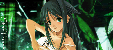
The border's a unique design from what I normally see, but it just doesn't quite reach me. It's not smooth enough in my opinion. And yeah, the font you used for your name is difficult to read. The subjects, though framed well, are a bit high in contrast, even if it's only black and white. The eyes just seem too dark. Then again, I probably just don't know what source image you used. I definately notice signs of layer blending and messing around with the opacity which for the most part works well. It's that horizontal line in the middle of the sig that makes me think that it could've been blended a little smoother. Not bad, though, for your first one. InternalBrain: 9/10 Quality of the individual and cropping is very very good. As for the background, I'd say she blends in a little too well. It takes a bit to isolate her from the rest of the canvas because the hues are so similar, but luckily she dominates a good portion of the canvas. You live up to your graphic designer title (says so beneth your name :P ). Ice Climbers: 8.5/10 My only beef with the sig is that there are a lot of dark specks on the left half that interupt the image (and a bit on the far right corner). Also, your name is a little difficult to locate. Ice Climbers (Sig Battle): 9/10 Here, your name is recognizable, though you kind of have to squint at it. I wasn't quite sure how to judge it for a while partly because it's that good. She's framed well and the background is stylish yet not too imposing. The only thing getting me is all those one-pixel specks. Looks like a layer that you forgot to add an effect to or something. kohakuslayer: 8/10 The blending is not as great as Ice Climber's version, but you have her edged to the right and the name on the left which seems to balance the whole canvas. You obviously went for a color balance to match with the tones of the sunset background, but I think she came out too red. Also, I'm not a fan of multiple layers of the same individual but blurred into the background. But that's not something I used to mark you down with. Kusion: 9.5/10 I was about to cry "ten" on this one, until I noticed the color transition on your border, or lack thereof. Otherwise, everything is perfect. |
|
|
|
|
2007-10-17, 03:24
|
Link #4338 |
|
The endless sky
Graphic DesignerJoin Date: Jun 2007
Location: Oosutoraria
Age: 34
|
Ice Climbers: Yours - 8.5/10. I don't think the white dots and so looks too good on the sig.
But other than that great outcome! I love it. <3 ^.^ Sig battle - Hmm, it looks nice, but to me it doesn't fit too well. 8/10 Reon-sama: Just doesn't click for me. Poor quality, and the boarder is a bit too unique for meh. xD 7/10 |
|
|
|
|
2007-10-17, 06:09
|
Link #4340 |
|
Reisen FTW!
Graphic DesignerJoin Date: Aug 2006
Location: Chicago,IL, USA!!!!
Age: 31
|
@Thingle: That looks really nice ]. Love the bruahes you put on it too. 10/10
@Reon-sama: low quality and I'm not feeling it. sorry 5/10 @Ice Climbers: First one 10/10 second 7/10.the second one why because it has too many thing on it and I can't read the text but it does look nice.  @Bloodstrike: All of them are 9/10 They are just too darn cool. <3 @kusion: <3 10/10
__________________
|
|
|
|
 |
| Tags |
| rate, signature |
|
|