2007-10-17, 22:21
|
Link #4362 | |
|
"Show it to me"
Join Date: Dec 2005
Location: In solitude, where we are least alone
|
Quote:
 @ Thingle: Another Miku sig eh? Nice one. 8/10 @ Diaboso: 8/10 @ zeldalover: I can still see the white BG over it. Perhaps making it transparent will do nice so it will look like a pop-up sig. Render has some jagged edges so perhaps a little fixing on that as well. Then again, it is Ayu after all 7/10
__________________
|
|

|

|
|
2007-10-18, 04:39
|
Link #4364 |
|
Retired
 Graphic Designer Graphic DesignerJoin Date: Mar 2007
Location: Princeton University
|
@Cyz-lol eye-patch girls are interesting
 Don't quite agree but nice sig, except the flow is kinda weird. The left render seems like it doesnt fit the overall design of the sig, but that may be just my humble opinion. 8/10 Don't quite agree but nice sig, except the flow is kinda weird. The left render seems like it doesnt fit the overall design of the sig, but that may be just my humble opinion. 8/10@Takeru- Interesting design, but the left winter breeze brush seems a little too random  8/10 8/10@mine- i changed a little of it, originally was: 
__________________
|
|
|
|
|
2007-10-18, 17:02
|
Link #4370 |
|
Reisen FTW!
Graphic DesignerJoin Date: Aug 2006
Location: Chicago,IL, USA!!!!
Age: 31
 |
@zeldalover: <3 10/10
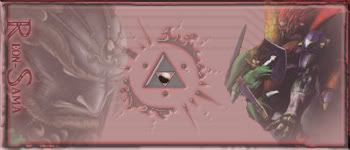
@Ice Climbers: Make her a little darker next time 9.7/10 @Reon-sama: Very nice siggy the text could be a little bigger 7/10 @Miko Miko: You really like using that font for your txt huh. Choose another font next time okay. 8.5/10 @Thingle: Love your signature but pick another back next time like read so it will look nice 9/10 @Takeru: Maybe the extra brushes isn't that nessesary but oh well. 8/10
__________________
|
|
|
|
|
2007-10-18, 22:02
|
Link #4371 |
|
~La-la Land~
Graphic DesignerJoin Date: Jul 2007
Location: Seattle
Age: 37
|
If I could get some constructive criticism w/ the rating, I'd greatly appreciate it. This is my first time playing around with ps, so any and all advice would be great!
Spoiler for Sig:
Oh yeah, and rating, Reon-sama: 8/10 I would really like except for the middle. The shadow seems a bit out of place..and creepy.
__________________
|
|
|
|
 |
| Tags |
| rate, signature |
|
|