2009-11-11, 15:36
|
Link #62 | |
|
toptoptoptoptoptoptoptopt
 Graphic Designer Graphic DesignerJoin Date: Jun 2008
Location: Behind you >:)
Age: 27
 |
Quote:
__________________
|
|

|
|
2009-11-11, 15:41
|
Link #63 | |
|
Very Sucky Sig/Ava Maker
Join Date: Nov 2009
Age: 28
|
Quote:
and i guess it does look like a resized it only when i stare at it
__________________
|
|
|
|
|
2009-11-11, 15:54
|
Link #66 |
|
(ノಠ益ಠ)ノ彡┻━┻
 Moderator ModeratorJoin Date: Mar 2006
|
Before we offer advice, it's helpful to know what program you use to make your signature. Photoshop? Microsoft Paint? GIMP? Paint.net? Other? Knowing what you use to make signatures means we can offer advice tailored to the program you use so you aren't as confused by what we're talking about (like brushes).
In the meantime, you can also check out the Fan Creations stickied topic called Sig/Avatar tutorials by the makers. In that thread are tons of links to guides and other information to help you get a start in making signatures and avatars.
__________________
|
|
|
|
2009-11-11, 15:55
|
Link #67 | ||
|
toptoptoptoptoptoptoptopt
Graphic DesignerJoin Date: Jun 2008
Location: Behind you >:)
Age: 27
|
[QUOTE=sayinterry;2761770]
Quote:
Just go to the paintbrush icon (Under the eraser in photoshop elements) Aaaaaand Ta-da~ You can start experimenting. And no reason for apology we're all n00bs once.  Quote:
__________________
|
||
|
|
|
2009-11-11, 19:44
|
Link #68 | ||
|
Strangely dependable...
Join Date: Nov 2006
Location: some random place out there...
|
Quote:
Quote:
__________________
|
||
|
|
|
2009-11-11, 21:49
|
Link #70 |
|
Saber's Husband XD
Join Date: Oct 2006
Age: 37
 |
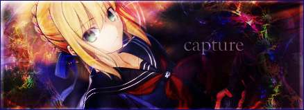
My try for the SOTM... >_< (need C&C) [actually there are 2 more pairs I'm working at and this was the 1st one to finished
1st draft     2nd draft 
__________________
Last edited by capture; 2009-11-11 at 22:01. Reason: My grammar sucks wth >_< |
|
|
|
2009-11-11, 23:42
|
Link #71 | |
|
Junior Member
Join Date: Nov 2009
|
Quote:
its got good depth , lighting is ok .. needs a little work .. the glow/shine on the sword is covering the face.. erase that bit or reduce the opacity i love the flow but the random dots r distracting , give em a lil blur and set em on overlay/soft light .. that should do the trick , and again .. the text needs some work gj~ |
|
|
|
|
2009-11-12, 00:45
|
Link #73 |
|
Very Sucky Sig/Ava Maker
Join Date: Nov 2009
Age: 28
|
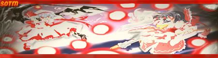
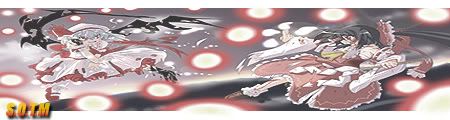
@beruko : even though i suck at sigs, my view as a person is that your sig really isnt clear enough. it has too many of what i think is specks (or maybe your c4d) i recommend clearing it up a little since i cant really make out the left person and i dont understand the point of the background for the right
|
|
|
|
2009-11-12, 00:52
|
Link #75 | |
|
The Shadow of Twilight
Graphic DesignerJoin Date: Sep 2008
Location: Cursed land.
 |
Quote:
edit: a bit of change  Last edited by Beruko08; 2009-11-12 at 01:35. |
|
|
|
|
2009-11-12, 03:37
|
Link #76 | |
|
GFX Designer :)
Graphic DesignerJoin Date: Sep 2009
Location: Secret xD dont ask plox :P
|
Quote:
ok here is my another version O_O of GOW RICK hope u like it xD temme changes!
|
|
|
|
|
2009-11-12, 07:43
|
Link #78 |
|
books-eater youkai
Join Date: Dec 2007
Location: Betweem wisdom and insanity
|
@capture, I prefered v2... when the central part was still showing.
@Beruko08 I would go with the latest version @Soul-Stealer is it me or the renders seem to mix too much on the effect ? I tried again my circular version reworked the color, sliced and resized it for using PNG24 for the transparent parts. C&C would be welcome.      Spoiler for version 4 of the rectangle version .:
__________________
|
|
|
|
2009-11-12, 11:37
|
Link #80 |
|
Anxious bookseller
AuthorJoin Date: Aug 2006
Location: Shibuya Psychic Research
|
Very VERY rough 1st draft, I already see a few things I need to fix. Mostly want to know if the animation fits, does it flow? Im not loving how InuYasha and Sessh-sama look in this image either, I tried making it better but appears I failed. Like I said, rough, rough draft.
(yes I know there is no border)   On the brightside I kinda figure out slicing 
__________________
|
|
|
 |
| Tags |
| contest, sotm |
|
|


 ...
...
 )
)


 :|::|
:|::|