2009-02-12, 11:29
|
Link #67 | ||
|
its a boy :o
Join Date: Jan 2009
Age: 32
|
Quote:
 Quote:
Okay well for starters, I noticed each one has some sort of grid pattern. My direct suggesiton would be to get rid of it because its very diruptive of flow. Any pattern can (doesn't have to) disrupt flow, especially one that is large and easily attention gained. 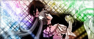 this one imo has the most flow so far (the color gradient overlay helped define the flow as well as half of the grid lines which helped the flow while the other half held it back) .... however the render doesn't match the entire global color spectrum :/ The render looks like it needs a dark background and surrounding and not one thats primarily made of whites and light color arrays. this one imo has the most flow so far (the color gradient overlay helped define the flow as well as half of the grid lines which helped the flow while the other half held it back) .... however the render doesn't match the entire global color spectrum :/ The render looks like it needs a dark background and surrounding and not one thats primarily made of whites and light color arrays.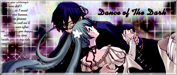 This one has a background that closer matches the render than any of your other entries because it does not contain so much light. This next one might actually be a better example of appropriate colors for your render 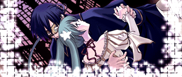 however it has that white stuff all around it and that is disruptive :/ however it has that white stuff all around it and that is disruptive :/
Last edited by Ehko; 2009-02-13 at 00:57. |
||

|
|
2009-02-12, 11:54
|
Link #68 |
|
❤ Fabulous MAX~! ❤
 Graphic Designer Graphic DesignerJoin Date: Dec 2005
Location: Poland -.-
Age: 35
 |
@ Katocchi
In my opinion you should change the colours of the background from those colourful ones to more toned etc. It will give the siq a more serene (?) felling, right now those colours reminds me of disco lights, which isn't good considering the render you're using. Btw. I made another changes, so please c&c       And a typical boring question: with or without text?  (but I think that I still prefer my ver. 2, which I made earlier...  ) )
__________________
|
|
|
|
2009-02-13, 01:29
|
Link #70 |
|
Your Order ?
Graphic DesignerJoin Date: Aug 2008
Location: in Your Planet
Age: 32
 |
Thanks for the C&C .. Ehko-san and Vibeke-san ..
And for Vibeke-san .. I think I prefer the new one with text but the color of the right image still little imo .. Well, Because I'm so Confused  .. this one is my Final Entry .. this one is my Final Entry 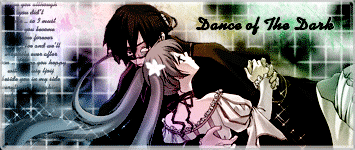
__________________
|
|
|
|
2009-02-13, 05:22
|
Link #71 | |
|
♪ ~ ♫
ArtistJoin Date: May 2008
Location: Europe
Age: 35
  |
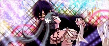
Can't believe I actually managed to find a dancing pic. >=D
Three versions, I'm yet again undecisive. Any C&C+color pick highly appreciated and noted.  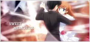  Quote:
The only slightly disturbing element seems to be the "wave" in front of her. Looks kinda odd in front of her hair. A subtle blur (0,5-2 px) in that area may enhance the look. Just a thought, not necessarily an improvement. Still, much better than the first version, suits the theme a little more.
__________________
|
|
|
|
|
2009-02-13, 08:56
|
Link #72 | |||
|
Reisen FTW!
Graphic DesignerJoin Date: Aug 2006
Location: Chicago,IL, USA!!!!
Age: 31
|
Quote:
 Quote:
Heres my entry its not my final but oh well. XD Any C.C  Edit: Crap the border isn't on there. ><
__________________
|
|||
|
|
|
2009-02-13, 10:15
|
Link #73 |
|
its a boy :o
Join Date: Jan 2009
Age: 32
|
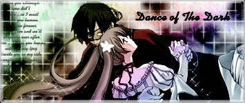
@Vibeke without text looks better @Arceon That's better. The movement is still pretty faded but it looks slightly more like dancing now. @Larthak :/ i cant decide... Maybe something between (right here)The abstract light strokes in the back disrupt flow but I guess that's okay :| Nicely balanced light based signature @konstargirl  and now we dropped anime in general (lol) and now we dropped anime in general (lol)Without border looks pretty good imo + likes the font, its blends well, though comparing it with her shirt, shouldn't it have an orange tint to match it too? |
|
|
|
2009-02-13, 10:53
|
Link #74 | ||||||
|
Black Dragon
Graphic DesignerJoin Date: Dec 2007
Location: In the Netherrealm, thinking who to betray next...
|
Quote:
Looks really good and I must say, very original  Quote:
Quote:
Quote:
Quote:
)I agree with Ehko, the sig looks goos without border
__________________
|
||||||
|
|
|
2009-02-13, 22:08
|
Link #77 | ||
|
Black Dragon
Graphic DesignerJoin Date: Dec 2007
Location: In the Netherrealm, thinking who to betray next...
|
Quote:
 Quote:
What about some ligh efects? (filter/ render/ lighting efects) This way you could focus the dancers and give the impression that they're in some kind of dancing contest, it's just a suggestion though
__________________
|
||
|
|
|
2009-02-13, 22:16
|
Link #78 | |
|
Kira_Naruto, the ecchi
Graphic DesignerJoin Date: Dec 2005
Location: http://www.exciting-tits.com/
|
Quote:
The text animation could do with a bit more smooth out tho
__________________
|
|
|
|
|
2009-02-13, 22:42
|
Link #79 | |
|
~Rock ☆~
Graphic DesignerJoin Date: Apr 2007
Location: In The Farplane
|
Quote:
__________________
|
|
|
|
 |
| Tags |
| contest, signature of the month, sotm |
|
|


 Moderator