AnimeSuki Forums

Register Forum Rules FAQ Community Today's Posts Search

Go Back   AnimeSuki Forum > Anime Related Topics > Fan Creations

Notices

Closed Thread
 
Thread Tools
Old 2010-05-15, 14:43   Link #101
LKK
Senior Member
 
 
Join Date: Nov 2006
Location: Virginia, USA
Age: 62
My first attempt. I'm intentionally going with simple this month.


Comments?
__________________

Avatar: Hazuki of Natsuyuki Rendezvous / Signature: flowers from Natsuyuki Rendezvous
LKK is offline  
Old 2010-05-15, 15:13   Link #102
Haladflire65
Senior Member
*Artist
 
 
Join Date: Mar 2009
Location: Normandy SR-2
Age: 29
Quote:
Originally Posted by LKK View Post
My first attempt. I'm intentionally going with simple this month.


Comments?
Hm, not bad, but I think you can add more to the background, and those arrows seem to detract too much from the render. Jut my opinion, though

Final Entry:


If Solace doesn't approve of that one then this instead.
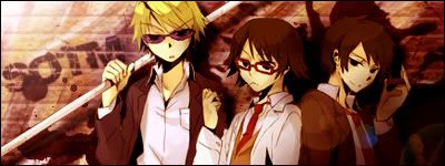
__________________
Haladflire65 is offline  
Old 2010-05-15, 15:59   Link #103
Kuniko
Put The Monkey DOWN!
 
Join Date: Apr 2010
Location: Amsterdam
Age: 35
Quote:
Originally Posted by Namiey View Post
other entry, if you like this more, i will make this my final entry, my 1st draft is rukia,

v1.

v.2


C&C appreciated.
I really like it.. It looks so mysterious and modern at the same time..


Im kinda new with making sigs.. I would really like to know what you all think of my entry


ps. Sorry for my english
Kuniko is offline  
Old 2010-05-15, 18:17   Link #104
Evil Rick
Black Dragon
*Graphic Designer
 
 
Join Date: Dec 2007
Location: In the Netherrealm, thinking who to betray next...
Quote:
Originally Posted by White Manju Bun View Post
My tries

Non animated


Animated


Im gonna fix the smoke (if I can) to make it look better, this was a very rough draft. But C&C on either? Im half tempted to go with the non-animated vers just cuz the quality on the other is better.
The animation at the animated one is almost unable to apreciate since the viewer must look very carefully to notice it. I would go with the static one but without the yellow sparks wich look a bit out of place since that yellow don't mix very well with the red of the background.

Quote:
Originally Posted by Larthak View Post
I had LS craze again about a month ago, so that's why I was so happy about this theme. Yeah, you guessed it, my entry is...


C&C appreciated!
Charming, it looks really good. Hmmm... you added the "spark" on her eye? If you did, try a version without it, to see how does it looks, if you don't and the render is like that, then it's okay.

Quote:
Originally Posted by abet17 View Post
2nd draft


ill change the text and rearrange the sparkle effect.......
The text was improved, definetly, and the re-arrange of the sparks don't look bad at all, I like how does it looks.

Quote:
Originally Posted by Namiey View Post
other entry, if you like this more, i will make this my final entry, my 1st draft is rukia,

v1.
I would stick with V1. The green of the C4D at V2 didn't looked very well. I like how does the sig mix the realistic bg with the colorfull rende, and it ends looking good.

Quote:
Originally Posted by LKK View Post
My first attempt. I'm intentionally going with simple this month.


Comments?
Hmmm... more than simple, I would say "rushed", it's not bad but... those blue arrows to be honest, look terrible. The whole sig is in reds, so the blue of them jump out of the context, the red of the border and text don't help either and the font isn't the ideal one.

Sorry if I sounded a bit harsh

Quote:
Originally Posted by Kuniko View Post
Im kinda new with making sigs.. I would really like to know what you all think of my entry


ps. Sorry for my english
For a firstimer, the sig looks really good, good chose of colors, a great placement and work on the text and nice efects. I do like this sig.
__________________
Evil Rick is offline  
Old 2010-05-15, 22:01   Link #105
Namiey
is busy...
*Artist
 
 
Join Date: Dec 2009
Location: Under the same sky that we watched
Age: 28
Send a message via Yahoo to Namiey
Quote:
Originally Posted by Kuniko View Post
I really like it.. It looks so mysterious and modern at the same time..


Im kinda new with making sigs.. I would really like to know what you all think of my entry


ps. Sorry for my english
it's really nice sig for your first one
btw, it's not an AS safe..
Final Entry:
__________________

Last edited by Namiey; 2010-05-17 at 09:26.
Namiey is offline  
Old 2010-05-15, 22:37   Link #106
ganbaru
books-eater youkai
 
 
Join Date: Dec 2007
Location: Betweem wisdom and insanity
@ LKK those blue arrows don't seem to serve any purpose exept to use space. I am sure than you can make somethi ng grrat reusing this render.
@ kuniko nice one for a beginer ( my firsts one where worse than that...)
__________________
ganbaru is offline  
Old 2010-05-17, 16:38   Link #107
LKK
Senior Member
 
 
Join Date: Nov 2006
Location: Virginia, USA
Age: 62
I started over, keeping the render but changing pretty much everything else. Based on a suggestion to change the color scheme, I made 2 versions. A red-based one to coordinate with her hair and a blue-based one to coordinate with her uniform. The idea behind the sig is that this is a banner advertising the school. Or something along those lines.


Comments? Color preferences?
__________________

Avatar: Hazuki of Natsuyuki Rendezvous / Signature: flowers from Natsuyuki Rendezvous
LKK is offline  
Old 2010-05-17, 17:21   Link #108
kamo
Senior Member
 
 
Join Date: Aug 2007
Location: Canada
Age: 33
^I like the red, and I think it works better for the theme since the uniform stands out more.

Quote:
Originally Posted by LKK View Post
At the very least, I think it needs a border of some type.
Quote:
Originally Posted by ganbaru View Post
@ kamoI would suggest to add more lightning differences, add a border and to use JPEG insted of PNG24.
Quote:
Originally Posted by Evil Rick View Post
It's a nice choose of colors for text and bg, perhaps... a border would look nice.
Thanks! ^^

v1 with border:


or v2 (darker):
?
__________________
kamo is offline  
Old 2010-05-17, 17:43   Link #109
ganbaru
books-eater youkai
 
 
Join Date: Dec 2007
Location: Betweem wisdom and insanity
@LKK I do prefer the blue one
@kamo I do prefer v1 but I would make some area even more pale.
__________________
ganbaru is offline  
Old 2010-05-17, 17:51   Link #110
Haladflire65
Senior Member
*Artist
 
 
Join Date: Mar 2009
Location: Normandy SR-2
Age: 29
Quote:
Originally Posted by LKK View Post
I started over, keeping the render but changing pretty much everything else. Based on a suggestion to change the color scheme, I made 2 versions. A red-based one to coordinate with her hair and a blue-based one to coordinate with her uniform. The idea behind the sig is that this is a banner advertising the school. Or something along those lines.


Comments? Color preferences?
I also like the blue one

On another note, the text can be reworked and the edges of the render look a little rough.
__________________
Haladflire65 is offline  
Old 2010-05-17, 23:34   Link #111
Evil Rick
Black Dragon
*Graphic Designer
 
 
Join Date: Dec 2007
Location: In the Netherrealm, thinking who to betray next...
Quote:
Originally Posted by LKK View Post
I started over, keeping the render but changing pretty much everything else. Based on a suggestion to change the color scheme, I made 2 versions. A red-based one to coordinate with her hair and a blue-based one to coordinate with her uniform. The idea behind the sig is that this is a banner advertising the school. Or something along those lines.


Comments? Color preferences?
I like the blue color at the second since it feels better along with the render... hmm, we could work a bit on the text, perhaps making it smaller, getting rid of the glowing efect and giving it a bit more of style, like this, it feels that it's there because it must be there.

Quote:
Originally Posted by kamo View Post
^I like the red, and I think it works better for the theme since the uniform stands out more.


Thanks! ^^

v1 with border:


or v2 (darker):
?
I like more the darker, since the whole sig is bright, a sark text & border gives a nice feeling of balance on the sig.
__________________
Evil Rick is offline  
Old 2010-05-18, 04:50   Link #112
NorthernFallout
The Interstellar Medium
*Author
 
 
Join Date: May 2008
Location: [SWE]
Age: 34
@kamo: I'd go with the darker version, as it feels more even. Though, you could emulate the softer text on it like you have on the light version, because it makes the text not so much "on top" and it merges better.
__________________

NorthernFallout is offline  
Old 2010-05-18, 07:37   Link #113
Marcus H.
Princess or Plunderer?
 
 
Join Date: May 2009
Location: the Philippines
Version Three. Added text.

__________________
Continuing: White Sand Aquatope (6/24) and Vanitas S2 (0/12), The Vampire Dies in No Time S2 and Bofuri S2 (3/12).
2021: Restaurant to Another World S2 (3/12), takt Op. Destiny (1/12) and Taisho Maiden Fairy Tale (1/12).
2022: Yuusha Yamemasu (1/12), Kaguya-sama S3, Mob Psycho 100 III (Oct06), Bleach: 1000 Year Blood War (2/13) and Chainsaw Man (6/12).
Spring 2023: Yamada-kun to Lv999 no Koi wo Suru, Kuma Kuma Kuma Bear Punch! (4/12), Skip to Loafer, Tonikaku Kawaii S2 (1/12), Otonari ni Ginga (5/12) and Kimi wa Houkago Insomnia (3/13).


Contact me on Wikia and MyAnimeList.
Anime List Status ~ Watching: 33. Completed: 468. Plan to watch: 39.
Marcus H. is offline  
Old 2010-05-18, 08:25   Link #114
NorthernFallout
The Interstellar Medium
*Author
 
 
Join Date: May 2008
Location: [SWE]
Age: 34
^ Take a look at the SOTM May 2010 text and think of what could be changed. It differs from the other text used (which fits to a degree) but the light behind hides it by quite a bit, creating a distraction. I'm not sure if fits well either. Maybe one without SOTM May 2010 would work better. Aditionally, you could complain of the quality of the pic, since it's slightly pixelly, but I think it works... border might be a bit too far in though, but that's just me. The entirety of it is fine IMO.
__________________

NorthernFallout is offline  
Old 2010-05-18, 10:45   Link #115
JRendell
Manga Addict
 
Join Date: Sep 2009
Location: England, UK
Age: 32
Lacking time this month so; Final Entry
JRendell is offline  
Old 2010-05-18, 11:47   Link #116
White Manju Bun
Anxious bookseller
*Author
 
 
Join Date: Aug 2006
Location: Shibuya Psychic Research
2nd vers, ditched the animation. I kept the yellow dots but just put them to the background a bit more and used another texture over them.


C&C?

Spoiler for Vers 1 for comparison:
__________________
Pandora HeartsManju's Stuff
"I will always remember
when the Doctor was me."
- 11th Doctor.

Sig by TheEroKing

Last edited by White Manju Bun; 2010-05-18 at 11:50. Reason: fixed link
White Manju Bun is offline  
Old 2010-05-18, 12:32   Link #117
Evil Rick
Black Dragon
*Graphic Designer
 
 
Join Date: Dec 2007
Location: In the Netherrealm, thinking who to betray next...
Quote:
Originally Posted by Marcus H. View Post
Version Three. Added text.

The lights behindn the "SOTM" makes itr hard to read and gives a feeling of forced placement of the text in the sig.

Quote:
Originally Posted by White Manju Bun View Post
2nd vers, ditched the animation. I kept the yellow dots but just put them to the background a bit more and used another texture over them.


C&C?

Spoiler for Vers 1 for comparison:
The yellow dots still fill out of place.
__________________
Evil Rick is offline  
Old 2010-05-18, 14:16   Link #118
Evil Rick
Black Dragon
*Graphic Designer
 
 
Join Date: Dec 2007
Location: In the Netherrealm, thinking who to betray next...
Oh yes... first try.


C&C?
__________________
Evil Rick is offline  
Old 2010-05-18, 15:29   Link #119
LKK
Senior Member
 
 
Join Date: Nov 2006
Location: Virginia, USA
Age: 62
@ Rick: The dark lower right seems a little at odds with rest of the lighter background color. Maybe another patch of dark somewhere on the left to balance it off? (And that's the weirdest set of eyes I've ever seen on Haruhi. No criticism or anything. Just an observation.)
__________________

Avatar: Hazuki of Natsuyuki Rendezvous / Signature: flowers from Natsuyuki Rendezvous
LKK is offline  
Old 2010-05-18, 16:39   Link #120
White Manju Bun
Anxious bookseller
*Author
 
 
Join Date: Aug 2006
Location: Shibuya Psychic Research
Quote:
Originally Posted by Evil Rick View Post
Oh yes... first try.


C&C?
Surprised you didnt go with the gender bending vers The border around Haruhi seems a little thick.
__________________
Pandora HeartsManju's Stuff
"I will always remember
when the Doctor was me."
- 11th Doctor.

Sig by TheEroKing
White Manju Bun is offline  
Closed Thread

Tags
signature of the month, sotm


Posting Rules
You may not post new threads
You may not post replies
You may not post attachments
You may not edit your posts

BB code is On
Smilies are On
[IMG] code is On
HTML code is Off

Forum Jump


All times are GMT -5. The time now is 13:31.


Powered by vBulletin® Version 3.8.11
Copyright ©2000 - 2024, vBulletin Solutions Inc.
We use Silk.