AnimeSuki Forums

Register Forum Rules FAQ Community Today's Posts Search

Go Back   AnimeSuki Forum > Anime Related Topics > Fan Creations

Notices

Reply
 
Thread Tools
Old 2007-01-30, 18:30   Link #1
Deathkillz
~ You're dead ^__^* ~
*Graphic Designer
 
 
Join Date: Apr 2006
Location: uk, England
Age: 34
Send a message via MSN to Deathkillz
Deathie's creations


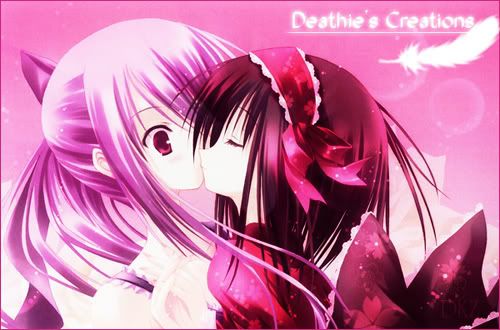
Welcome to my area of random GFX work where I showcase my (now infrequent) past time. v1.2


UPDATE!: 20/06/09

Current Signature ~


Recent Siggies


1) INTRODUCTION

Spoiler for brief intro to how I got into photoshop:


2) Before the great hiatus
  1. 2.1) These are a random mash of my early attempts at making signatures. I can't say that they are anything worth to look at but they provided a stepping stone for me.

    Spoiler for earlier works:


    ------------------------------------------------------------------------------------------------------

  2. 2.2) The following works are stuff made with a little more knowledge of Photoshop. Still nothing great :/

    Spoiler for middle tier:

    ------------------------------------------------------------------------------------------------------

  3. 2.3) Now this was where I started to become more confident with creating signatures of viewable qualities and from here on it should not be that cringing to look at for those seasoned GFXers.

    Spoiler for later works:


------------------------------------------------------------------------------------------------------

The year that got away.

Amazingly I had completely forgotten what it is to "update" and thus have left this area stuck in the past of 2007. Funnily enough procrastination is an odd thing that takes time away from things that are important and invests them into something that isn't. I suppose that I will feel the sting of it pretty soon but for now I can finally find an excuse to update this thread


3) Lost year and the coming of the great hiatus
  1. 3.1) Signatures! Well surprisingly I have a lot of them lined up but without comments for now.

    Spoiler:

  2. 3.2) Renders! I now have those too! May not be a large list but damn do they take time to do

    Spoiler:

  3. 3.3) Vectors...err...sorry Dan I can't do them ;_;
  4. 3.4) Avatars, a whole selection of them all randomly arranged here...actually...why the heck are there so many Dansen avies!

    Spoiler:

------------------------------------------------------------------------------------------------------


4) The great hiatus


Believe it or not I have been missing for almost half a year since later September 2008 from the GFX front. The reason simply being this was the year I was kicked out of my warm and fuzzy house to face the cold harsh world and this thing called University that literally saps away any of my previous carefree time. Thus sadly I haven't produced much in support of the GFXers here but there were times where I do have strokes of inspiration...
  1. 4.1) Signatures
    Spoiler:

  2. 4.2) Renders


  3. 4.3) Avies
    Spoiler:


[More to come in the distant future...]
__________________

Siggy: hohohohoho~ | AnimeHistory welcome to our blog ~ | Summer2009 early review
Under the radar series Summer2009: Kanamemo, GA Geijutsuka Art, NEEDLESS

Last edited by Deathkillz; 2009-08-03 at 23:55.
Deathkillz is offline   Reply With Quote
Old 2007-01-30, 19:56   Link #2
White Manju Bun
Anxious bookseller
*Author
 
 
Join Date: Aug 2006
Location: Shibuya Psychic Research
Not bad, its better then anything I ever came up with. Ill say that the Nerine one was my fav, looked the best in my opinion. Not a huge fan of the text in the sigs though since you used the same font over and over so again, not a bad start
__________________
Pandora HeartsManju's Stuff
"I will always remember
when the Doctor was me."
- 11th Doctor.

Sig by TheEroKing
White Manju Bun is offline   Reply With Quote
Old 2007-01-30, 21:52   Link #3
celcius
Aspiring but lazy
 
 
Join Date: Dec 2005
Location: The Internet
Harhar, you say those are bad? Those can't be as bad as my uber crop-clean-copypastaBG-addlines+text skills~ ToT

The Iriya / Illya one for great win BTW.
celcius is offline   Reply With Quote
Old 2007-01-30, 22:57   Link #4
Daniel E.
AniMexican!
 
 
Join Date: Dec 2005
Location: Monterrey N.L. Mexico
I agree with celcius, Dont say yours are bad or I may have to bring out my old Utawarerumono ones to show you how bad a sig can sometimes get.

Seriously though, The Nerine does look cool.
__________________
Daniel E. is offline   Reply With Quote
Old 2007-01-31, 01:34   Link #5
Deathkillz
~ You're dead ^__^* ~
*Graphic Designer
 
 
Join Date: Apr 2006
Location: uk, England
Age: 34
Send a message via MSN to Deathkillz
Quote:
Originally Posted by White Manju Bun View Post
Not a huge fan of the text in the sigs though since you used the same font over and over so again, not a bad start
well yea at that time i also dont have any good fonts was actually commented on my "signature" font and how i never change it back then in the rate your sig thread
Quote:
Originally Posted by kayos View Post
What's that DKZ Shimi suppose to be? It looks like 3 eyeballs collided.
my other nick

and well yea just starting photoshop back then really made me have a laugh at what i can do now ~ but still i dont think i was critical then because i knew what stage of development i was able to get up to ~ not the look pretty bad no me

and you guy find the Nerine one nice? ^_^ funny how the simplest things give the best results ^__^
__________________

Siggy: hohohohoho~ | AnimeHistory welcome to our blog ~ | Summer2009 early review
Under the radar series Summer2009: Kanamemo, GA Geijutsuka Art, NEEDLESS
Deathkillz is offline   Reply With Quote
Old 2007-01-31, 11:03   Link #6
felix
sleepyhead
*Author
 
 
Join Date: Dec 2005
Location: event horizon
You rock Dethie... xD
Yeah like people said stop saying your's aren't good or well be forced to shower you with our abominations

Post Scriptum
DKZ Shimi sounds cooler. What does it mean?
__________________
felix is offline   Reply With Quote
Old 2007-01-31, 11:18   Link #7
Dark-Wolf
Junior Member
 
Join Date: Jan 2007
the last one is pretty good i like the effects for it , and like the others said stop saying your not good or else ill bite you , im a wolf
Dark-Wolf is offline   Reply With Quote
Old 2007-01-31, 14:28   Link #8
Deathkillz
~ You're dead ^__^* ~
*Graphic Designer
 
 
Join Date: Apr 2006
Location: uk, England
Age: 34
Send a message via MSN to Deathkillz
Quote:
Originally Posted by Cats View Post
You rock Dethie... xD
Yeah like people said stop saying your's aren't good or well be forced to shower you with our abominations

Post Scriptum
DKZ Shimi sounds cooler. What does it mean?
im scared but i just dont want to come across as arrogant with whatever little skillz i has back in those days

and my other nick ~ well obviously DKZ means Deathkillz and the "shimi" bit is a merge from shinigami ^__^ makes me sound less threatening in a sense lol...

ps updated first post ^__^
__________________

Siggy: hohohohoho~ | AnimeHistory welcome to our blog ~ | Summer2009 early review
Under the radar series Summer2009: Kanamemo, GA Geijutsuka Art, NEEDLESS
Deathkillz is offline   Reply With Quote
Old 2007-01-31, 14:52   Link #9
Daniel E.
AniMexican!
 
 
Join Date: Dec 2005
Location: Monterrey N.L. Mexico


OH SHI- ... This one rocks.

If it wasn't made at the request of someone else, I would have grabbed it on the spot.
__________________
Daniel E. is offline   Reply With Quote
Old 2007-01-31, 16:12   Link #10
Deathkillz
~ You're dead ^__^* ~
*Graphic Designer
 
 
Join Date: Apr 2006
Location: uk, England
Age: 34
Send a message via MSN to Deathkillz
Quote:
Originally Posted by Daniel E. View Post


OH SHI- ... This one rocks.

If it wasn't made at the request of someone else, I would have grabbed it on the spot.
thx ~ well actually you could give Ichy a PM and ask about it ^__^

and added a new bit ~ vectoring...and this is your field of art daniel ^_^ any tips?
__________________

Siggy: hohohohoho~ | AnimeHistory welcome to our blog ~ | Summer2009 early review
Under the radar series Summer2009: Kanamemo, GA Geijutsuka Art, NEEDLESS
Deathkillz is offline   Reply With Quote
Old 2007-01-31, 17:01   Link #11
Daniel E.
AniMexican!
 
 
Join Date: Dec 2005
Location: Monterrey N.L. Mexico
Quote:
Originally Posted by Deathkillz
and added a new bit ~ vectoring...and this is your field of art daniel ^_^ any tips?
Vectoring!!, let me see.......


Quote:
Originally Posted by Deathkillz


well this is my first ever vector work in progress ~ and it did take me a while to get motivated...but really it not that hard once i understood the concept

did a little mistake for the tie in forgetting that it had an insignia but ill soo fix that
Looking good so far; Though, what actually amazes me the most is the fact that you went straight to the Shape Layers method.

You also got a good source pic, wich can help a lot when you are working out the little details in the end.

Quote:
Originally Posted by Deathkillz
soo far its going well but im just dreading doing the eyes from the tutorial the person said that doing the eyes is best when left last and ill take the advice from the expert ^__^
Eyes are actually pretty easy to make (or so I think ). Just pick your base color for them, then make the colored 'U' pattern on another layer(s) (Pen tool) and end adding the light effects (could be gradients, blurs, or whatever you think could make them look cool) on another one.

If you ask me, doing hands and fingers is far more complicated. >_<!!!

Oh, and dont be afraid of the original pic. If you think something needs to be changed, just go ahead and do it.
__________________
Daniel E. is offline   Reply With Quote
Old 2007-01-31, 17:24   Link #12
Deathkillz
~ You're dead ^__^* ~
*Graphic Designer
 
 
Join Date: Apr 2006
Location: uk, England
Age: 34
Send a message via MSN to Deathkillz
Quote:
Originally Posted by Daniel E. View Post
Looking good so far; Though, what actually amazes me the most is the fact that you went straight to the Shape Layers method.
well yes i figured if im gonna do it i might as well do it the hard (and long) way you make the eyes part sound soo easy but im still perplexed when looking at them

oh and it reminds me quick question for ya how do you do the tones of colours such as the darker bit in the hair etc?
__________________

Siggy: hohohohoho~ | AnimeHistory welcome to our blog ~ | Summer2009 early review
Under the radar series Summer2009: Kanamemo, GA Geijutsuka Art, NEEDLESS
Deathkillz is offline   Reply With Quote
Old 2007-01-31, 18:20   Link #13
Daniel E.
AniMexican!
 
 
Join Date: Dec 2005
Location: Monterrey N.L. Mexico
Quote:
Originally Posted by Deathkillz View Post
oh and it reminds me quick question for ya how do you do the tones of colours such as the darker bit in the hair etc?
You mean the color of shadows and light effects?

Those are just darker/lighter versions of the base color on another layer. I always split colors so that one layer never has more than one. Then I just blur the edges and play a little bit with the oppacity % to get the desired result.


Mind you, I am no good at making my own colors, so I simply grab them from other pics (HQ Wallpapers, Game CG, etc.) with the eyedropper tool.
__________________

Last edited by Daniel E.; 2007-01-31 at 18:32.
Daniel E. is offline   Reply With Quote
Old 2007-02-01, 10:52   Link #14
KiNA
Kira_Naruto, the ecchi
*Graphic Designer
 
 
Join Date: Dec 2005
Location: http://www.exciting-tits.com/
Seeing a skill evolving is fun .. GJ ^^b

Oh yea.. that Haruhi sig is golden. I like the BG.

NOW GET MORE FONTS DAMMIT

Oh .. I like you insignia too =3

If Rika come here to spam like I do.. dont listen to his advice about brushes is overated .. BRUSH IS COOOL!!!

*runs*
__________________
“This be the realest shit I ever wrote.” ~Tupac
So very dead right now.. but still breathing thank you.
Top 4 Manga Waifu
>> Tsukiumi
>> Saeko Busujima
>> Himuka
>> Yui Kotegawa


KiNA is offline   Reply With Quote
Old 2007-02-01, 11:22   Link #15
felix
sleepyhead
*Author
 
 
Join Date: Dec 2005
Location: event horizon
Yeah it does seem you reused some fonts again and again...
I have aproximatly 1200 or so extra fonts installed how about you?
__________________
felix is offline   Reply With Quote
Old 2007-02-01, 11:34   Link #16
KiNA
Kira_Naruto, the ecchi
*Graphic Designer
 
 
Join Date: Dec 2005
Location: http://www.exciting-tits.com/
damn.. mind is just 998 on the latest count .. and that includes the default fonts =/

I still have some fonts left unzipped from my dafont webbie raids tho .. just its troublesome to unzip and install them
__________________
“This be the realest shit I ever wrote.” ~Tupac
So very dead right now.. but still breathing thank you.
Top 4 Manga Waifu
>> Tsukiumi
>> Saeko Busujima
>> Himuka
>> Yui Kotegawa


KiNA is offline   Reply With Quote
Old 2007-02-01, 12:30   Link #17
Riker
Peek a boo
*Graphic Designer
 
 
Join Date: Dec 2005
Brushes are overrated!!! (because I don't know how to use them)
Riker is offline   Reply With Quote
Old 2007-02-01, 15:33   Link #18
Deathkillz
~ You're dead ^__^* ~
*Graphic Designer
 
 
Join Date: Apr 2006
Location: uk, England
Age: 34
Send a message via MSN to Deathkillz
Quote:
Originally Posted by Kira_Naruto View Post
Seeing a skill evolving is fun .. GJ ^^b

Oh yea.. that Haruhi sig is golden. I like the BG.

NOW GET MORE FONTS DAMMIT

Oh .. I like you insignia too =3

If Rika come here to spam like I do.. dont listen to his advice about brushes is overated .. BRUSH IS COOOL!!!

*runs*
lol new fonts are overrated well actually i have a little over 1000 but most of them is just ugly >.< (stupid DL pack)

but yea i need new fonts :/

p.s thanks Daniel E. for the tip ^__^ i will try to finnish that asap! now i need to think up of a good BG design

also updated with my last bunch of creations ^__^
__________________

Siggy: hohohohoho~ | AnimeHistory welcome to our blog ~ | Summer2009 early review
Under the radar series Summer2009: Kanamemo, GA Geijutsuka Art, NEEDLESS
Deathkillz is offline   Reply With Quote
Old 2007-02-01, 15:52   Link #19
Radiosity
Sexy Tornado
*Artist
 
 
Join Date: Dec 2005
Location: The European Bunion
Age: 45
I've got some 600 hand picked fonts installed. I don't download packs, too much junk that I would never use. It'd probably take longer to sort through them all than it does just to go through a site page by page and pick the good ones.

Oh, and Font Xplorer is a really handy program to have open any time you're editing sigs and such in photoshop

edit: Well, since I've just fixed my internet problems and can actually upload to my site again, I've zipped my fonts and upped them for you Deathkillz:

Clickies for a present! (little over 9mb)

Just extract and install, simple as that

Last edited by Radiosity; 2007-02-01 at 16:29.
Radiosity is offline   Reply With Quote
Old 2007-02-01, 17:40   Link #20
MugenIchiban
Member
 
 
Join Date: Jun 2004
You should try some brushing or smudging. I think it would improve your backgrounds more than filters.
MugenIchiban is offline   Reply With Quote
Reply

Tags
signature


Posting Rules
You may not post new threads
You may not post replies
You may not post attachments
You may not edit your posts

BB code is On
Smilies are On
[IMG] code is On
HTML code is Off

Forum Jump


All times are GMT -5. The time now is 06:08.


Powered by vBulletin® Version 3.8.11
Copyright ©2000 - 2024, vBulletin Solutions Inc.
We use Silk.