2009-01-08, 23:51
|
Link #81 |
|
its a boy :o
Join Date: Jan 2009
Age: 32
|
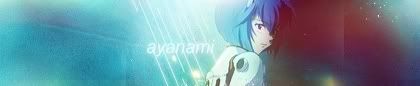
O.o well i was trying to keep it spacey, but heck, no one else is doing it, so ill join them and just "slap an anime char on a space background and blend it a lil"
so here's me in second gear (still kinda rusty but ill get there soon :< )  EDIT: gah forgot how light the post background was, shouldn't have bothered with the two transparent corners <_< and that text might not be big enuf i think C&C always welcome  AGAIN: fixed: filesize, corners, text, dimensions :/  gosh i hope no one see all those jpeg artifacts >< .... ARG!!! why do we have such an absurdly small file size limit anyways >< Last edited by Ehko; 2009-01-09 at 01:39. |

|
|
2009-01-09, 01:18
|
Link #82 | ||
|
(ノಠ益ಠ)ノ彡┻━┻
 Moderator ModeratorJoin Date: Mar 2006
|
Quote:
 Quote:
1. The contest enforces the forum signature rules for entries. Saves on moderation headaches. 2. The size limit forces people to work within a set of limitations. It's a challenge. Don't stress over a few artifacts, people aren't going to vote you down for that unless it's incredibly distracting. 3. Optimized properly the differences between JPG and PNG aren't noticeable in smaller images without heavy comparison. 4. Because those are the rules and they aren't changing. Second version is slightly too big (51k), and I liked your previous version better, although I agree the transparent borders were difficult to see. Chopping half the signature off makes it feel like it's lost something though.
__________________
Last edited by Solace; 2009-01-09 at 02:52. |
||
|
|
|
2009-01-09, 07:16
|
Link #83 | |
|
its a boy :o
Join Date: Jan 2009
Age: 32
|
Quote:
O.o it comes out at 50.1k for me, but i understand. Anyways, keeping the original size would be impossible. That 51k not only is obviously sized down by about half in dimensions, but its also hovering at jpeg quality 8 :< which is the highest medium you can have. Im picky about artifacts because they stand out so much to me (not in a "each artist are their worst critique sense") i mean i spot them easily and i hate them :/ ....:  ugh the artifacts D: well its right at 49.9k for me but i hate all the artifacts in it :< until further notice though, i guess this is my current entry Last edited by Ehko; 2009-01-09 at 19:36. |
|
|
|
|
2009-01-09, 08:49
|
Link #90 | ||
|
Your Order ?
 Graphic Designer Graphic DesignerJoin Date: Aug 2008
Location: in Your Planet
Age: 32
 |
Quote:
Quote:
__________________
|
||
|
|
|
2009-01-09, 19:15
|
Link #93 | ||
|
Anxious bookseller
AuthorJoin Date: Aug 2006
Location: Shibuya Psychic Research
|
Quote:
Quote:
Ok 2nd draft, changed the "stars are" text and did some color tweaking  C&C?
__________________
|
||
|
|
|
2009-01-09, 19:46
|
Link #94 |
|
its a boy :o
Join Date: Jan 2009
Age: 32
|
i said this before you deleted your original post so ill just copy the pasta down to here
"lunarsun i think, you need to get the img url that imageshack offers you but suggests you don't use because it doesn't advertise their service Its okay for a first, but your trying to make too many focal points (try to keep it down to only one or two focal points, and make everything blend around those). Right now, every planet feels like it is, or almost is, a focal point. I also liked the text ;P however your typography needs some work, but if your just starting, don't jump onto that just yet, work on the focal points first. " simple1 I very much like how you incorporate your c4ds and match them with the flow  very nice. very nice.Last version you posted is on my fav list now white manju bun thanks, im glad you like mine I like your new version, though the saturation is just borderline of too high imo, but i like it near borderline of too high sometimes :3 I would say, if your daring enough, to improve your sig, you could try to blend the char with the background a little so they don't just seem like one image on top of another. You could do this pretty easily if you wanted to keep it simple and just add some white brush around your char and blur it to appear like the glow from the background is working around the edges of your render. Sorta like an HDR effect or something. Not sure how well it will work though so you might wanna try experimenting with that a little bit ;P otherwise its looking good
|
|
|
|
2009-01-09, 20:47
|
Link #97 | |
|
Anxious bookseller
AuthorJoin Date: Aug 2006
Location: Shibuya Psychic Research
|
Quote:
Edit: @konstargirl: I like the background but the render really sticks out, like Ehko was saying with mine, you need to blend around the characters more, you can really tell they arent part of the bg. Also maybe some saturation or color balance since the color needs some help. :3 But again, I do like the background.
__________________
|
|
|
|
|
2009-01-09, 21:01
|
Link #98 |
|
its a boy :o
Join Date: Jan 2009
Age: 32
|
solace
tips on how you did that plozies And what i meant about the filesize wasn't to get rid of the limit, just not make it so small. It would seem like more work to make sure people follow such a limit when simply doubling the limit size would make more sigs follow the rules while not really slowing users down by much :x EDIT: konstargirl That... doesn't look like it should have taken 2 hours but anyways, i kinda like it The pixel render ...(wait, did u draw that? :O?!) erm well its really good if u did. The overlaying color adjustment filters though are very, very cold  and cold doesn't match either of their clothing colors are you sure you want to overlay it with blue? Why not try something closer to the original color of that dress she is wearing (it looks like it was originally red and black). You could try pink for instance maybe? or maybe even a mix of blue and pink? and cold doesn't match either of their clothing colors are you sure you want to overlay it with blue? Why not try something closer to the original color of that dress she is wearing (it looks like it was originally red and black). You could try pink for instance maybe? or maybe even a mix of blue and pink?lol and AGAIN: white manju bun just make the white glow on another layer on the top
|
|
|
|
2009-01-09, 21:08
|
Link #99 |
|
Reisen FTW!
Graphic DesignerJoin Date: Aug 2006
Location: Chicago,IL, USA!!!!
Age: 31
|
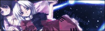
@White Manju Bun : Um actually its a stock not a render.
 But thanks on the adivce though. :3 But thanks on the adivce though. :3@Ehko: Maybe, but I wanted to give out more of a feeling like they are actually in outerspace. SO thats why theres alot of purple and blue on it.
__________________
|
|
|
|
2009-01-09, 21:15
|
Link #100 |
|
its a boy :o
Join Date: Jan 2009
Age: 32
|
hmm.... in that case the cold is fine i guess, but then its your focal point that isn't blending into your theme of a cold space :/
your render/stock/w.e is feeling cold, but its not blending with the background real well if you know what i mean :/it is kinda the same as i said to white manju bun, just your focal point and background colors are inverted (light on dark and dark on light i mean) so blending it would be a lil different too :\ |
|
|
 |
| Tags |
| contest, signature of the month, sotm |
|
|