2010-07-23, 16:37
|
Link #101 |
|
Senior Member
Join Date: Oct 2008
Location: Finland
Age: 33
 |
Can I request a signature from you ? ^^
I'm looking for a Nanoha sig ( StrikerS - adult one  ), and I wanted to ask you because I love your style. Like Rennir said, each sig looks different but you maintain your own distinct style :P. ), and I wanted to ask you because I love your style. Like Rennir said, each sig looks different but you maintain your own distinct style :P.I tried looking for some pictures to use in the signature, but no luck so well.. I guess I'll leave everything to you. Just don't include any text, besides Nanoha Takamachi with appropriate text color .. orangeish ? You can put the Patchy Designs if you want to, but put it on some corner then. Ps. Did you do those signatures that said Techno Magic in them as well ? I saw some people using them around the Nanoha sub-forum, and I liked those alot as well but didn't know who made them.
__________________
|

|

|
|
2010-07-24, 06:34
|
Link #102 | ||
|
練紅玉
 Graphic Designer Graphic DesignerJoin Date: Apr 2010
Location: Magic Land
|
Quote:
and also some pics are really nice to begin with, I've only tweak and edit some minor details in them. Quote:
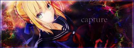
By the way I also saw those sigs (Techno magic ones), sadly I'm not the one who created them, it was "capture" though I rarely see him/her in the Fan Creations thread nowadays, and I'm not a fan of techno one's 
__________________
|
||
|
|
|
|
2010-07-24, 11:51
|
Link #103 |
|
Senior Member
Join Date: Oct 2008
Location: Finland
Age: 33
|
Tuesday is fine or whenever you find some time
 . Nanoha will be my next sig after I get tired of my current one, but I thought I'd request in advance. . Nanoha will be my next sig after I get tired of my current one, but I thought I'd request in advance.If you find some good picture with both Nanoha and Fate in it, you could do a signature out of that too. ( Or instead, if you'll only make one )Edit : You can add text in the signature actually, if you come up with something fitting but then a text-less version would be nice for comparison.
__________________
Last edited by Dist; 2010-07-26 at 08:18. |
|
|
|
|
2010-07-25, 20:49
|
Link #104 | |
|
Saber's Husband XD
Join Date: Oct 2006
Age: 37
 |
Quote:
ok I'm getting out of topic here, Patchy you've really created some lots of signature for the past weeks eh?  another hardworking fellow >_< , and it seems those are really good sigs, they're always shine btw another hardworking fellow >_< , and it seems those are really good sigs, they're always shine btw  Keep up the good work >_< hope to see more touhou in this thread
__________________
|
|
|
|
|
|
2010-07-25, 22:42
|
Link #105 | ||
|
練紅玉
Graphic DesignerJoin Date: Apr 2010
Location: Magic Land
|
Quote:
Quote:
Oh thanks! hardworking? not really yup I love it when they're shining [don't worry I will create more touhou sigs in the future, since I'm planning to make a set of them, the whole Unthinkable Natural law cast]ok updates: Electromaster updates   will set them as donations in the railgun thread (safe version)
__________________
Last edited by Patchy; 2010-07-25 at 23:12. |
||
|
|
|
|
2010-07-27, 20:38
|
Link #108 | |
|
練紅玉
Graphic DesignerJoin Date: Apr 2010
Location: Magic Land
|
Quote:
Now time for another updates It's a new style for me (but maybe not for others), kinda experimenting for some style that I can use. Misaka Mikoto (1st try)[low fx]  Sanae Kochiya (2nd try)[medium fx]  Patchouli Knowledge (3rd try)[high fx] 
__________________
|
|
|
|
|
|
2010-07-28, 20:40
|
Link #110 | |
|
練紅玉
Graphic DesignerJoin Date: Apr 2010
Location: Magic Land
|
Quote:
Some updates for today. (requests) Fate Testarossa Harlaown  Mio Akiyama  As you can see I'm still trying to get those chaotic effects, ") still haven't used to that effects until now still haven't used to that effects until now
__________________
|
|
|
|
|
|
2010-07-28, 20:59
|
Link #111 |
|
Destruction by Carnage
Graphic DesignerJoin Date: Jul 2010
Location: NYC
Age: 32
 |
Hah yeah, try not to cover your focal so much. It tends to ruin the render and the lighting.
The Fate Sig needs the lighting to be toned down and the render is sorta overblended. Other than that it looks neat. The top right corner has a "wavey" part, I would take that out, sorta ruins the depth (that or blur it more). In the Mio sig, the lack of flow sorta hurts this one. All though it's not necessarily bad to have things all over the place, I think it's too much for that sig.
|
|
|
|
|
2010-07-28, 21:41
|
Link #112 | ||
|
練紅玉
Graphic DesignerJoin Date: Apr 2010
Location: Magic Land
|
Quote:
so that's why I dunno if that will be alright in the eyes of some peeps, since someone said that it's bright and also someone said it's just fine, that's my main problem on that issue , maybe it just depend on the client's (requester) eyes Quote:
About those two, hmm first of all thanks for the tips, you're right on that matter I'm kinda experimenting how to lined up those effects, in the fate sig, I'm experimenting if the ripple effect will turned out to be not that flashy (just like only a smudge since I'm a noob, I mean I have really no experience in smudging, the one ruined that IMO was the 2 light source (down and up) I think that's too much, that's why it tend to be so bright About the Mio, I'm kinda hardheaded when it comes to a render, the render is too good, I didn't think about the flow anymore, I can do that if I'll remove the guitar part right? but in my mind that will be a waste to remove so that's it, instead of the flow issue I just follow the layout issue but again, applying the new style it again tends to be so bright *sigh* anyway thankies for the tips again
__________________
|
||
|
|
|
|
2010-07-29, 01:01
|
Link #113 |
|
Destruction by Carnage
Graphic DesignerJoin Date: Jul 2010
Location: NYC
Age: 32
|
Go to the the tutorial thread, there is this guy named ookami, look for him within the links. He has a good tutorial on smudging, I also recommend you go to DevianART for some smudge brushes, but definitely check the tutorial by him, he's a great graphic artist.
|
|
|
|
|
2010-07-29, 03:15
|
Link #114 |
|
練紅玉
Graphic DesignerJoin Date: Apr 2010
Location: Magic Land
|
Thanks, but I'm not focusing on smudging a bit, though you can call me arrogant I just want to learn some tricks without reading some tutorial, though someone guided me before
anyway thanks, yup he sure is great.
__________________
|
|
|
|
|
2010-07-29, 11:08
|
Link #115 |
|
Member
Join Date: Jul 2010
|
Yo, i got another request patchy, http://fc00.deviantart.net/fs45/f/20...ma_by_ExBu.png can you make another sig out of this one
Size : 450x150 Text : Mio Akiyama That's all im looking for thanks. |
|
|
|
|
2010-07-29, 11:52
|
Link #116 |
|
Welcome to Kourindou
Join Date: Sep 2008
Location: A Boring Island
Age: 40
|
Is really many time that i don't post on another page so i come for a little greeting
 Always happy to see more Patchy around, so i like it So continue with your works, that is always good see more of them
__________________
|
|
|
|
|
2010-07-29, 23:29
|
Link #117 |
|
南宮 那月
Join Date: Mar 2007
Location: こころ
Age: 33
|
Can I ask a request again? if you don't mind, I want a Suika Ibuki signature because she was the character I'm always using in the fighting game of Touhou.
I just leave it the picture to you. Will credit you again after that. THANKS as always.
__________________
|
|
|
|
|
2010-07-30, 06:45
|
Link #118 |
|
Covered in Darkness
Graphic DesignerJoin Date: Jul 2010
Location: Missing~
|
Only 2 months? Your signatures are great! I thought you were a veteran or something! All your sigs are love <33333
It's been a month since I have been using PS, but I don't have much free time in real life, so I only manage a couple of sig per week or so. Oh, and I demand some tutorials :P You should make some! (Especially for sanae2, patchouli05copy, sanae5copy, mio01copy, mio05 and maybe for all others =D). Btw, where do you get your signature tutorials? Take Care; hope you share more~
__________________
Last edited by Star-Wing; 2010-07-30 at 06:57. |
|
|
|
|
2010-07-31, 13:51
|
Link #119 |
|
→[Chia]←
Join Date: Jul 2010
Age: 33
|
Heyyy :]
Your siggies are really amazing for 2 months of photoshop D: Like seriously, they're even stunning to a friend who's been using photoshop for over 2 years; and she was wondering if you would mind telling her which abstract glow line brush set you used in most of your Shrine of the Gensokyo Realms signatures If possible, could you please provide a link? Thankyouuuu :3 Chia |
|
|
|
|
2010-08-01, 17:40
|
Link #120 | |||
|
練紅玉
Graphic DesignerJoin Date: Apr 2010
Location: Magic Land
|
Quote:
Quote:
Quote:
they're called aj-swirl brushes. Here's the link of his page, SwirlsWill post some updates later on.
__________________
|
|||
|
|
|
 |
| Tags |
| patchy, signatures, touhou |
|
|